Journal · By Anas · Updated August 21, 2026 · 7 min read
How to Use Texture in Interior Design — A Practical Guide
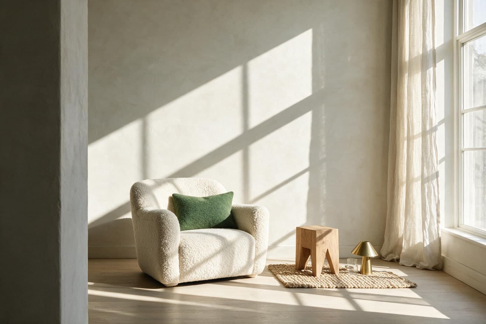
Texture is the fastest way to fix a room that looks right and feels wrong. The short answer to how to use it: give light more than one thing to do. Mix surfaces that soak light up, like boucle, wool and matte plaster, with surfaces that scatter it gently, like raw wood, ceramic and jute, and add one or two that throw it straight back, like brass, glass or a mirror. Most flat-feeling rooms have plenty of color and almost no variety in how their surfaces behave under light. Everything below is how to do that on purpose.
You probably know the feeling. Everything in the room is fine on paper. The sofa was the right sofa. The paint is the color you spent two weekends choosing. And it still lands like a hotel lobby: correct, and slightly dead. I spent a long time assuming that was a taste problem, the kind of thing you either have or you hire. It usually isn't. It is a texture problem, and texture is the part of a room that costs the least and gets skipped the most.
What does texture actually mean in interior design?
Texture is how a surface handles light. That definition is more useful than the usual one about how things feel under your hand, because you meet almost every texture in a room with your eyes long before you touch it. You are not really seeing a wool rug. You are seeing what wool does to the light landing on it.
There are only four behaviors worth knowing. Some surfaces absorb: a boucle sofa, a wool rug, matte paint, velvet. Light goes in and very little comes back, which is why these things read as soft and quiet. Some scatter: unsealed oak, lime plaster, jute, unglazed ceramic. Light comes back, but broken up, so the surface looks alive from any angle. Some reflect: brass, glass, glazed tile, a mirror. They hand the light back with interest and give a room its sparks. And some transmit: a linen curtain turns a hard rectangle of glare into a soft glowing panel.
Once you see surfaces as light behaviors instead of materials, the shopping question changes. It stops being does this match, and becomes what does this do that my room cannot already do. That question is worth more than any rule about mixing rough with smooth.
Why does my room look finished but feel flat?
Try this before you buy anything. Stand in the doorway and squint until the room goes slightly out of focus. Color drops out first, and what is left is light and shade. A room with working texture still shows variation when you squint: dark pockets in the pile of a rug, a highlight along a wooden edge, a small hot point of brass, a wall that gets softer toward the corner. A flat room collapses into one even tone, like a photo with the contrast slider pulled to zero.
That is what went wrong with a decade of grey and beige rooms, and it was never really the beige. It was matte paint on a smooth plasterboard wall, a flat-woven sofa, flat blinds, and a laminate floor with a photograph of wood grain printed on it. Every one of those is a perfectly reasonable object. Put them in a room together and light has exactly one thing to do, which is nothing.
How many textures should a room have?
Stop counting materials and start counting behaviors. The working minimum for any room you actually sit in is one absorber, one scatterer and one reflector. If you have a window, transmit comes almost free with a linen curtain.
This is why a room can fail the squint test while owning plenty of texture on paper. A linen sofa, linen curtains and linen cushions look like three textures on the receipt. In the room they are one behavior repeated, and the light has nowhere to go. Meanwhile a small dark room that gets no direct sun almost always needs more reflectors than anyone gives it, because there is not enough light coming in to waste on surfaces that swallow it whole.
This is also the honest answer to why some cheap rooms look expensive and some expensive rooms don't.
Read: Cheap Ways to Make a Room Look Expensive →What do people get wrong with texture?
- ·Buying the set. The matching cushion, throw and rug in the same weave from the same shop is a single behavior sold three times. Sets are how shops make choosing easy, and easy is why the room looks like a display.
- ·Working at only one distance. Most people add texture through cushions and stop there, which is the one distance that does the least.
- ·Confusing pattern with texture. A printed woodgrain floor is a picture of texture. It still reflects light like plastic, because it is plastic, and the squint test catches it instantly.
- ·Keeping texture in the soft things only. Fabric is the easy half. The hard surfaces of a room, the walls, floor, table and lamp base, cover far more area and are usually all doing the same smooth nothing.
- ·Going all rough. A room where every surface is nubby, woven and raw gets tiring in a way people rarely diagnose. Smooth is a texture too, and it is what gives the eye somewhere to rest.
How do you layer texture without making a room look cluttered?
Work at three distances, because a room is read from three of them. From across the room you only register the big surfaces: the rug, the curtains, the wall, the largest upholstered thing. At arm's reach it is cushions, throws, a lampshade, the top of a table. At touching distance it is the mug, the book cloth, the grain on a stool. Rooms that feel rich are usually doing something at all three. Rooms that feel like a showroom have done the middle one and left the other two smooth.
Then repeat. A texture that shows up once in a room looks like an accident. The same texture echoed somewhere across the room looks like someone meant it. Rattan on the chair and rattan on the pendant. Brass on the lamp and brass on the door pull. This is the same rule that makes color work, and it is the reason restraint reads as expensive: you are using fewer things, more deliberately, in more places.
One loud texture per room is plenty. I have a second-hand oak stool that cost about the same as a coffee, with a scorch mark near one edge that I assume came from a pan. It does more for my living room than a lamp that cost fifty times as much, because the lamp is smooth and painted and the stool has grain you can read from the doorway. That gap between what a room costs and what it does is basically this whole article.
Which textures suit my style?
Every style is really a texture palette wearing a color scheme. It is the surfaces, far more than the paint, that tell you which style you are looking at. Here is what each one is made of, if you want the deeper guide:
- Japandi: paper, matte ceramic, pale oak, and a lot of deliberately empty wall
- Scandinavian hygge: sheepskin, chunky wool, warm lamp glow, unfinished pine
- Biophilic: living leaves, stone, unsealed wood, anything that was recently alive
- Minimalist: matte plaster and stone, where the texture does the job color usually would
- Warm modern: boucle, walnut, brushed brass, a soft plaster wall
- Light and airy: sheer linen, cotton, whitewashed wood, transmit over absorb
- Modern farmhouse: shiplap, jute, aged iron, scrubbed timber
- Boho: rattan, macrame, kilim pile, the most texture-forward style there is
- Coastal: sun-bleached wood, rope, raw cotton, matte white
- Mid-century modern: teak grain, tweed, smoked glass, a hard leg against a soft seat
- Moroccan: tadelakt plaster, hand-knotted wool, pierced brass throwing light around
- Cottagecore: quilted cotton, worn enamel, dried flowers, nothing box-fresh
- Dopamine decor: glossy lacquer, velvet, checkerboard wool, reflect turned up loud
- Maximalist: velvet, gilt, layered rugs, texture stacked until it becomes the point
Not sure which of these is yours? Find your style in two minutes, no forms and no email.
Take the free Room Style Quiz →How do I know what my own room is missing?
This is the genuinely hard part, and it is not a knowledge problem. You have stopped seeing your own room. You walk through it every day and your brain edits it down to furniture-shaped blanks, which is exactly why the squint test works: it forces you to look at the room instead of recognizing it.
The other way to break that blindness is to see your own space next to a version of itself that has been sorted out, which is what we built RoomCalm to do. Upload a photo of the actual room, keep your walls and your layout and your things, and see what changes when the surfaces start doing different jobs. It is free and it takes seconds, and the useful part is the comparison rather than the picture.
Whichever way you go about it, expect the same result. The room usually does not need more things in it. It needs three or four of the things already there to be doing something different with the light.
See your own room with the textures sorted out. Your walls, your things, free and no sign-up.
See my room, layered →Quick answers
What is texture in interior design?
Texture is how a surface handles light. Some surfaces absorb it (wool, boucle, velvet, matte paint), some scatter it (raw wood, plaster, jute), some reflect it (brass, glass, mirror), and some transmit it (a linen curtain). You experience texture with your eyes long before you touch anything, which is why a room can look flat even when its colors are right.
How many textures should a room have?
Count behaviors rather than materials. Any room you sit in wants at least one surface that absorbs light, one that scatters it, and one that reflects it. A linen sofa with linen curtains and linen cushions is three textures on the receipt but only one behavior in the room, which is why it still reads flat.
How do you add texture to a room cheaply?
Texture is the cheapest upgrade in design because most of it is removable and second-hand. A wool or jute rug, a linen curtain over an existing blind, one wooden object with visible grain, and one small reflective piece like a brass lamp or a mirror will change a room more than repainting it. Rentals are ideal for this, since none of it touches the walls.
What is the difference between texture and pattern?
Pattern is a picture on a surface. Texture is what the surface does to light. A printed woodgrain floor has the pattern of wood and the light behavior of plastic, so it reads as flat no matter how good the print is. Squint at a room and pattern disappears while real texture stays visible.
Can a minimalist room have texture?
Minimalist rooms depend on it more than any other style. With little color and few objects, texture is the only thing left doing the work, which is why minimalist interiors lean on lime plaster, stone, matte ceramic and visible wood grain. A minimalist room with smooth painted walls and a flat sofa is the flattest room there is.