Journal · By Anas · Updated October 8, 2026 · 9 min read
Eider White by Sherwin-Williams: the cool white that borrows its temperature from your window
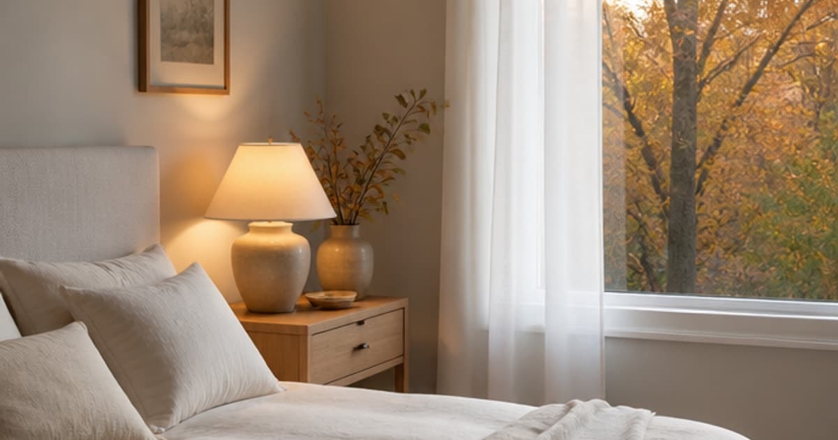
Straight answer first: Sherwin-Williams Eider White (SW 7014) is a light off-white with a gray undertone, a published LRV of 73.219 (Sherwin-Williams, read 8 October 2026), and a hex of #E2DED8 as an on-screen approximation. Sherwin-Williams files it under its White family and describes it as cool. It suits bright rooms where a plain white feels like a dentist's waiting area and a proper gray feels too heavy, and it's one of the more forgiving whites to live with because it rarely glares.
Here's the odd part. Convert that published hex to Lab and it lands a hair toward warm of neutral, which is not what the word "cool" leads you to expect. So who's right, the label or the number? Both, as it turns out, and the reason is the whole story of where Eider White works and where it quietly turns gray on you.
Is Eider White a warm white or a cool white?
Eider White is a cool white by Sherwin-Williams' own label, with a gray undertone, but its published hex sits so close to neutral that the color takes its temperature from the light in the room. Sherwin-Williams describes it as a "cool white paint and its gray undertone" (Sherwin-Williams, read 8 October 2026). The published values are hex #E2DED8 and RGB 226 / 222 / 216. Red is four points above green and green is six above blue, which is a faint lean toward warm. Converting the hex to Lab gives roughly L 88.6, a +0.3, b +3.4, computed on screen from the published hex values, so on a screen it sits just a hair on the warm side of dead neutral.
Why the gap? A gray undertone has no color of its own to push back with. In cool daylight it picks up the blue of the sky and reads cool, which is the behavior the label describes. Under a warm lamp it drifts the other way. It's a white that agrees with whoever spoke last. The label assumes a window; your room may have a lamp.
What does an LRV of 73 mean on a real wall?
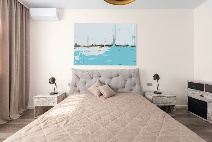
An LRV of 73 means Eider White sends back roughly 73 percent of the light that lands on it, which makes it a light color but noticeably less bright than the whites people usually put on trim. Sherwin-Williams' room-orientation guide explains the scale: 0 reflects no light and 100 reflects all of it (Sherwin-Williams, read 8 October 2026). The full published figure for Eider White is 73.219. For comparison, Extra White (SW 7006) sits at 85.861 and Alabaster (SW 7008) at 82.215, while City Loft (SW 7631) is 70.468. So Eider White gives back about nine points less light than Alabaster and about three more than City Loft.
On a wall, nine points is the difference between a white that glows and a white that behaves like a very pale gray. In a bright room Eider White reads white. In a dim one it slides to the gray side, the way a white T-shirt looks gray at the back of a closet. And if you paint the ceiling the same shade, a ceiling at 73 bounces less light down than a ceiling at 85 would, so the room will feel a touch lower.
How does Eider White behave in a north-facing room?
Eider White in a north-facing room will usually read as a pale gray rather than a white, because north light is both the dimmest and the coolest light a house gets. Sherwin-Williams' orientation page says north-facing rooms receive the least light and that the light is cool, and it advises warm neutrals with warm undertones, telling you to avoid cool undertones and to choose a higher LRV (Sherwin-Williams, read 8 October 2026). Eider White carries a cool label and a gray undertone, and its LRV of 73 is middling for a white. None of that is in its favor here.
It doesn't make a north room off-limits. A large north-facing room with a wide window and a pale floor can still carry it as a soft, quiet gray-white. But if you were hoping for a bright white, the room will hand you a gray and keep the change. Here's the fine print: the gray gets stronger after dark, so judge a sample at night too, with the lamps you actually own switched on.
What happens to Eider White in south, east and west light?
Eider White keeps more of its whiteness in south, east and west light, and in the east and west rooms the time of day matters more than the compass point. Sherwin-Williams says south-facing rooms get consistent warm light, so most colors work there and neutrals look warmer while cool tones look more neutral (Sherwin-Williams, read 8 October 2026). Expect Eider White to read as a soft, clean white in a south room, its gray mostly hidden.
East-facing rooms get warm light in the morning and cool light in the evening; west-facing rooms get the reverse. Sherwin-Williams' advice is to pick for the hours you use the room most. So an east-facing bedroom shows Eider White at its warmest while you're having coffee and at its grayest when you're reading at night. A west-facing living room does the opposite, grayish at breakfast and warm at the hour you actually sit down in it. One can of paint, two moods a day, like a thermostat somebody keeps nudging.
Warm bulbs or cool bulbs with Eider White?
Eider White looks warmer and softer under warm bulbs and grayer and crisper under cool bulbs, so the bulbs you already own are part of the color decision. Sherwin-Williams' guidance notes that warm bulbs feel cozier but are typically dimmer, while white or cool light suits bathrooms and home offices (Sherwin-Williams, read 8 October 2026). Put that together with a gray-undertone white. In a bedroom lit by warm lamps, Eider White drifts toward a creamy gray and the "cool" label stops being obvious. In a bathroom under cool white light the gray steps forward and the wall reads cleaner, close to clinical if the tile is gray as well.
Neither result is a mistake. But notice it before you buy, because a paper chip in the hardware store sits under the shop's cool tubes, and the same chip propped on your nightstand under a warm bedside lamp looks like a different card entirely. We'd rather you find that out on the nightstand than on the wall. Hold the sample under the light you'll really use, at the hour you'll really use it.
Eider White vs Alabaster, City Loft and Drift of Mist: how far apart are they?
Eider White sits at an on-screen distance of 2.1 from City Loft, 2.4 from Drift of Mist, 4.2 from Snowbound and 4.5 from Alabaster, so all five are close relatives and the differences are mostly lightness. We computed these as on-screen distance from published hex values (CIELAB, CIE76), so they describe screens, and real paint can read differently. Our scale words: under 2 is "hard to tell apart", 2 to 5 is "very close", 5 to 10 is "same family", and 10 or more is "no real match".
The pattern in the table is simple. Alabaster (L 92.7) and Snowbound (L 92.8) sit about four lightness points above Eider White (L 88.6), which matches the LRV gap of 82 versus 73. City Loft (L 87.2) and Drift of Mist (L 86.4) are a touch darker and warmer. So if Eider White feels a shade too gray on your wall, Alabaster is the obvious step up, and Sherwin-Williams calls it a "soft, warm but balanced white". If it feels too bright, Drift of Mist lives next door; Sherwin-Williams lists Eider White among Drift of Mist's coordinating colors, which is as close to a family tree as paint gets.
| Shade | Code | Hex (on-screen approximation) | LRV (SW) | Distance from Eider White | What that means |
|---|---|---|---|---|---|
| Eider White | SW 7014 | #E2DED8 | 73.219 | - | The reference shade |
| City Loft | SW 7631 | #DFDAD1 | 70.468 | 2.1 | Very close; a touch warmer and darker |
| Drift of Mist | SW 9166 | #DCD8D0 | 69.14 | 2.4 | Very close; slightly deeper, SW lists them as coordinating |
| Snowbound | SW 7004 | #EDEAE5 | 82.771 | 4.2 | Very close; mostly lighter, shares the gray undertone |
| Alabaster | SW 7008 | #EDEAE0 | 82.215 | 4.5 | Very close; lighter and warmer |
| Extra White | SW 7006 | #EEEFEA | 85.861 | 5.9 | Same family; the trim-white step up |
| Pale Oak (Benjamin Moore) | OC-20 | #DDD6CA | not read | 4.3 | Very close; warmer and a little darker on screen |
| All White (Farrow & Ball) | No. 2005 | #F3EFE4 | not read | 6.4 | Same family; brighter and warmer |
Shortlisting more than one white? Open the visualizer with Eider White loaded, then swap shades on the same photo of your room. Free, no sign-up.
Try Eider White on your room, free →Which white trim sits best next to Eider White?
The trim white that sits best next to Eider White is a brighter, cleaner white such as Extra White (SW 7006) or Pure White (SW 7005), both of which Sherwin-Williams points at trim. Extra White has a published LRV of 85.861 and Sherwin-Williams calls it an "ideal choice for trim and ceilings". Pure White sits at 83.957 with the "slightest yellow undertone", and the brand's note says "Use on trim" (Sherwin-Williams, read 8 October 2026). Either gives you about 11 to 13 LRV points of step-up from a wall at 73.219, which is enough for the trim to read as trim instead of as a slightly confused wall.
Snowbound (SW 7004), LRV 82.771, is Sherwin-Williams' own coordinating pick for Eider White and shares its slight gray undertone, so wall and trim come from the same mood. Pure White's hint of yellow adds a little warmth at the edges, which can help in a cool room. Wood trim is a different question, and we'll be plain about it: a screen can't show you what oak grain or a dark stain does beside a gray-white. Hold the chip against the real door frame.
Which rooms suit Eider White, and where does it struggle?
Eider White suits bright bedrooms and living rooms with decent daylight, and it struggles in a dim north-facing room under cool bulbs, where it can go flat and gray. Sherwin-Williams' own orientation advice tells you to avoid cool undertones in north light and to reach for warm ones, and Eider White is a cool-labeled white with a gray undertone (Sherwin-Williams, read 8 October 2026). We'd rather say that now than after the second coat.
In a dim north room under cool bulbs, Eider White can go flat and gray.
Where it does well is anywhere a pure white would glare. A south-facing room keeps it soft and clean. An east-facing bedroom you use in the morning gets it at its warmest. A kitchen with warm wood lets the gray take the edge off the white. Sherwin-Williams calls it versatile enough for any room, and in good light that claim holds. The brand's own coordinating colors are Snowbound (SW 7004), Morris Room Grey (SW 0037) and Aqua-Sphere (SW 7613), a scheme that stays quiet, like a house where nobody raises their voice. A basement office lit by cool tubes is where we'd pick something warmer.
Already know the room? Work out how many gallons your walls will take before you buy.
How much paint for this roomIs there a Benjamin Moore color close to Eider White?
The Benjamin Moore color closest to Eider White in our catalog is Pale Oak (OC-20), at an on-screen distance of 4.3, which our scale calls "very close" and which is still a different paint. We compute that from the published hex values, #E2DED8 for Eider White and #DDD6CA for Pale Oak as stored in our catalog, so it's a screen measurement rather than a verdict on a wall. On screen Pale Oak reads a little warmer and a little darker. Farrow & Ball All White (No. 2005, #F3EFE4 in our catalog) is further off at 6.4, "same family", and brighter.
We haven't read Benjamin Moore's or Farrow & Ball's LRVs for this article, which is why the table says "not read" rather than a guess. If you're loyal to a Benjamin Moore store, take a Sherwin-Williams chip of Eider White with you and hold it against Pale Oak in daylight. Two chips in a window beat any number on this page, ours included.
Want the nearest shade in another brand? Paste a code or a hex and the matcher ranks the closest ones in our catalog. Free.
Find the closest match in other brandsCan you preview Eider White on a photo of your own room for free?
Yes, you can preview Eider White on a photo of your own room for free with RoomCalm's paint visualizer, and the link below opens it with SW 7014 already loaded and named. It's free and unlimited, needs no sign-up, runs in your browser, and the photo never leaves your device. What you get is an on-screen approximation in your room's own light, which is the useful part: it shows whether your particular window turns Eider White white or gray before you spend anything. It won't show sheen, and it can't paint only the trim.
In October 2026 we made links like this one open the visualizer with the shade already on your walls. We're still improving it; ornate cornices and moldings can catch paint at the ceiling line. If you want the whole photo repainted by AI, there's an optional "Precise" mode: one free run a day with no sign-up, the $9 pack adds 5, and the $15/month plan includes 20. It's told to leave doors, trim and mirrors alone, though that isn't guaranteed.
Upload a photo of your room and see Eider White on your own walls. Free, unlimited, no sign-up, and the photo stays on your device.
Try Eider White on your room, free →Comparing visualizer apps before you commit to one? Our honest field guide, including the ones that beat us.
The best paint visualizer appsIs a paint sample still worth buying after you preview Eider White?
Yes, a sample is still worth buying after you preview Eider White on screen, because a screen can't show how paint reads on a real wall in real light, and Sherwin-Williams makes sampling cheap. The brand gives up to 10 free color chips at 2 x 3 inches, and its peel-and-stick samples at 8 x 8 inches cost $3.95 each, or $3.50 each when you buy four or more (Sherwin-Williams, read 8 October 2026). Put the 8 x 8 on the wall that gets the least light, then look at it at breakfast and again after the lamps come on.
One last honesty note. Every LRV, hex and RGB value above is Sherwin-Williams' published color data, read on 8 October 2026, and every distance is our own calculation from those hex values, so it describes a screen and only a screen. We haven't painted a board in Eider White. The number to remember is 73.219: light enough to read white in a bright room, low enough to settle into gray in a dark one. Which of those your room does is something no page can tell you, because no page has stood in it at dusk.
Want the warm-beige alternative? Accessible Beige is the other Sherwin-Williams neutral people cross-shop, and its LRV surprises in the opposite direction.
Accessible Beige SW 7036 reviewedQuick answers
Is Eider White warm or cool?
Eider White is a cool white by Sherwin-Williams' own description, with a gray undertone, though its published hex (#E2DED8) sits almost neutral on screen. That's why it reads cool in cool daylight and softer under warm lamps. Think of it as a near-neutral white that takes its temperature from the room's light.
What is the LRV of Sherwin-Williams Eider White?
Eider White has a published LRV of 73.219, usually rounded to 73 (Sherwin-Williams color data, read 8 October 2026). On the 0 to 100 scale that makes it a light color but about nine points below Alabaster (82.215) and about thirteen below Extra White (85.861), so it reads as a soft white in bright rooms and as a pale gray in dim ones.
Is Eider White too gray for a north-facing room?
It can be, because Sherwin-Williams advises avoiding cool undertones in north light and Eider White's gray undertone comes forward there, especially under cool bulbs. A large north room with a wide window and a pale floor may still carry it as a quiet gray-white. Test a sample and look at it after dark as well as at midday.
What trim color goes with Eider White?
Extra White (SW 7006, LRV 85.861) or Pure White (SW 7005, LRV 83.957), both of which Sherwin-Williams flags for trim, give about 11 to 13 LRV points of contrast against Eider White's 73.219. Snowbound (SW 7004, LRV 82.771) is Sherwin-Williams' own coordinating pick and shares the slight gray undertone if you want wall and trim from the same mood.
What Benjamin Moore color is closest to Eider White?
Benjamin Moore Pale Oak (OC-20) is the nearest in our catalog, at an on-screen distance of 4.3 from Eider White's published hex, which our scale calls "very close" and which is not the same color. Pale Oak reads a little warmer and darker on screen. Hold a chip of each side by side in daylight before you decide.