By Anas · Updated October 28, 2026 · 10 min read
City Loft by Sherwin-Williams: The White People Call Greige
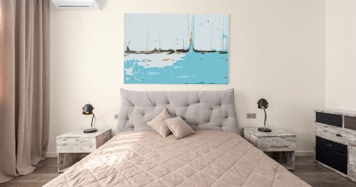
City Loft (SW 7631) is a warm off-white that Sherwin-Williams files as a White, LRV 70.468, on-screen approximation #DFDAD1 (Sherwin-Williams, read 28 October 2026). Plenty of people call it a greige, and SW's own blurb pitches it for "bigger, more open spaces." Both descriptions are true at once, which is the whole reason it deserves a closer read than a chip in a store.
We haven't painted a wall in it. Everything below comes from published figures: Sherwin-Williams' color data and lab coordinates, the LRV line it recommends for north-facing rooms, and our on-screen distances to the shades it gets cross-shopped against, including three strip neighbors that are near-twins on a screen and strangers in the catalog copy. Read the numbers, then buy a sample, because a screen has never sat on your floor next to the trim.
Is City Loft a white, a greige or a beige?
City Loft is a white by Sherwin-Williams' own filing, an off-white with a beige lean by its numbers, and a greige only in the loose sense that people reach for it when a gray feels cold. SW files SW 7631 in its White family and lists it in "Finest Whites & Neutrals," "Top Interior Colors" and its "Top 50 Colors." The lab numbers SW publishes are L 87.209, a +0.139 and b +5.014: very light, a hair to the red side, a modest lean to yellow. Yellow with a touch of red is beige, so the undertone is real. It's just small.
The filing makes more sense next to the colors people confuse it with. Agreeable Gray (SW 7029), which SW files as a Neutral, has an LRV of 60.386, about 10 points darker. Accessible Beige (SW 7036) is 57.67, almost 13 points darker. City Loft at 70.468 sits with the whites, not the greiges, the way a pale latte is still mostly milk. Call it a white with a beige accent and you'll buy the right trim for it.
Where are the "red undertones" Sherwin-Williams talks about?
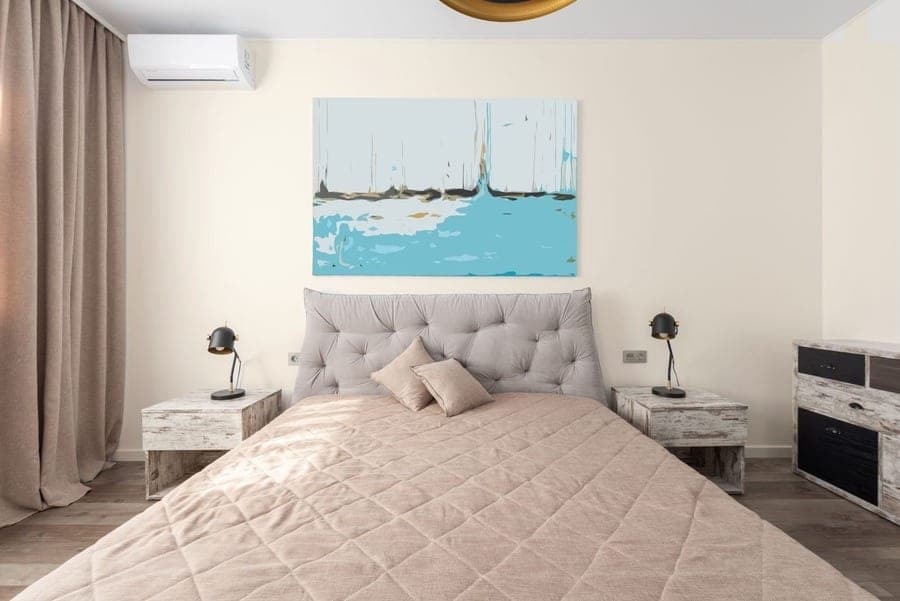
The red undertones live in Sherwin-Williams' published a value of +0.139 and in the pigment itself, and only one of those shows up on a screen. SW's description reads, in full: "Make your bigger, more open spaces feel more inviting with this warm off-white with beige and red undertones." The RGB channels back the warm claim: red is the highest at 223, green 218, blue the lowest at 209 (Sherwin-Williams, read 28 October 2026). A 14-point gap between red and blue is what a warm off-white looks like written as numbers.
But the a value is +0.139. On the red-green axis that's barely off center; a screen can't render a lean that small, and your eye won't catch it on a chip either. What the trade calls a red undertone is the pigment story: the colorants that build the mix, and the way they shift when warm light or a red-toned floor lands on them. A hex is the finished cake, not the recipe. The recipe is where the red is, and the only way to read it is a sample on your wall.
Why does Sherwin-Williams pitch City Loft for big, open spaces?
Sherwin-Williams pitches City Loft for big, open spaces because a warm off-white at LRV 70.468 bounces most of the light around a large room without the glare a brighter white can bring, and its blurb says so in its own words: "Make your bigger, more open spaces feel more inviting." Open-plan rooms have a lot of wall, often lit from two or three directions, so one color has to survive several kinds of light at once. A whiter white like Snowbound (SW 7004, LRV 82.771) can go stark across a long run. A neutral like Agreeable Gray at 60.386 holds more light than a big room usually wants to give up.
City Loft splits the difference, about 12 points under Snowbound and 10 above Agreeable Gray. Its strip position tells the same story: on store strip 259 it sits at C6 of 7, the second-deepest on a strip of whites, which is why it reads as a color on a long wall rather than a blank. Big rooms are like big dinner tables. Nobody wants the tablecloth to be the loudest thing on them.
Does an LRV of 70 hold up in a north-facing room?
Yes, on Sherwin-Williams' own guideline: City Loft's LRV of 70.468 clears the 60 LRV line SW recommends for north-facing rooms by about 10.5 points, and it carries the warm undertone the same page suggests. SW's neutral paint colors page: "To counteract the blue light in north facing rooms, look for a paint that has a 60 LRV or higher." It names Drift of Mist (SW 9166, LRV 69.14) among its examples; City Loft is about 1.3 points brighter. Rainwashed misses the same line by under a point, from the cool side.
Here's the honest arithmetic for the hard case. In a small, dim north room under cool LEDs, a warm off-white at 70 has its b value of +5.014 fighting blue daylight and a blue-leaning bulb at once. Energy Trust of Oregon's rule applies: "A higher Kelvin number produces a cool, white or bluish light." The likely result is a wall that reads flat or faintly dingy, warmth cancelled rather than shown, like running the heating with a window open. That's reasoning from the numbers, not a test. A 2700K bulb, which Energy Trust says people prefer in bedrooms, puts the warmth back. Drift of Mist is the grayer answer to the same room.
Can anyone tell City Loft from Egret White, Windfresh White or Aesthetic White?
On a screen, almost nobody could: Egret White sits 0.71 from City Loft, Windfresh White 0.73 and Aesthetic White 1.28 on our CIE Lab distance scale, all under the 2 we call "hard to tell apart." Their LRVs cluster too: Egret White (SW 7570) 69.642, Windfresh White (SW 7628) 69.188, Aesthetic White (SW 7035) 73.097, against City Loft's 70.468. All four lean yellow by our calculation, b values between 5.02 and 5.64. Windfresh White is next door at C7 on strip 259, Aesthetic White at C4.
The names and the blurbs disagree far more than the numbers do.
SW calls Windfresh White a "cool blast of violet-tinged white." Aesthetic White gets "A subtle violet undertone gives this cool white a dove-like calmness." Egret White has "Stone undertones." And City Loft is "warm" with "beige and red undertones." Cool, violet, stone and warm red, within 1.3 of each other on a screen. A hex carries the finished mix and nothing about the colorants; the pigment story only reads on a wall. Drift of Mist (SW 9166) is 0.99 away, filed as a Neutral and called a gray. Four families, nearly one color on a screen, and only a sample can referee.
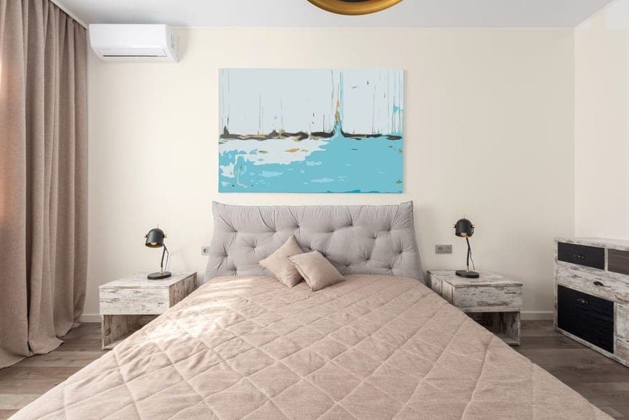
Upload a photo of your room and see City Loft on your own walls, in your own light. Free, no sign-up, runs in the browser.
Try City Loft on your roomHow much darker and warmer is Agreeable Gray than City Loft?
Agreeable Gray (SW 7029) is about 10.1 LRV points darker than City Loft, 60.386 against 70.468, and roughly as warm: its b value is 5.71 by our calculation, against City Loft's 5.02 (Sherwin-Williams, read 28 October 2026). Lightness is nearly the whole difference. In lab terms Agreeable Gray sits at L 81.90 and City Loft at L 87.21, and the on-screen distance between them is 5.36, which we call the same family. SW's own words: "Our best-selling paint color ... With a beige undertone, this gray exudes a subtle warmth." Filed as a Neutral, on-screen approximation #D1CBC1.
Here's the clean version. Agreeable Gray is the greige people believe City Loft is; City Loft is the white one step above it with a matching lean. If Agreeable Gray felt heavy on your sample board, City Loft is the lighter sibling. If City Loft looks like nothing on the wall, Agreeable Gray gives it a body. One step further warm and dark is Accessible Beige (SW 7036), LRV 57.67, 7.57 away with a b value of 8.74; Accessible Beige has its own write-up. Pick by how much light you want the wall to keep.
Snowbound or Dover White: which trim makes City Loft look deliberate?
Snowbound (SW 7004) is the trim that makes City Loft look deliberate, and it's Sherwin-Williams' own coordinating white for it: LRV 82.771, about 12.3 points brighter, with a lean toward gray that leaves City Loft as the warm one in the pair. SW describes Snowbound as a "versatile cool white" with a "slight gray undertone" (on-screen approximation #EDEAE5). Its b value by our calculation is 2.77 against City Loft's 5.02, so the trim reads crisp and the wall reads soft. On-screen distance between them: 6.02.
Dover White (SW 6385) is nearly as bright at 82.52 and goes the other way: SW calls it "A warm, sun-splashed white," and its b value of 7.50 is yellower than City Loft's. Put it on the trim and the frame is warmer than the picture, so City Loft reads grayer and cooler by comparison. Distance 6.15. Both whites give about 12 points of contrast; the question is which direction you want City Loft pushed. Snowbound makes it look chosen. Dover White makes it look like it's trying to be a gray. Dover White has the full numbers if you're tempted anyway.
What happens next to oak floors, Taupe Tone and a deep blue accent?
Next to oak floors City Loft's beige lean lines up with the wood and reads warmer and more beige; next to Taupe Tone it reads whiter; next to a deep blue like Connor's Lakefront it reads warmest of all. Oak carries yellow and red, the side City Loft's b +5.014 and a +0.139 already sit on, so nothing sets the wall apart and the eye reads one warm field. Cozy in a bedroom, a little flat where a lot of floor shows.
Taupe Tone (SW 7633) is one of SW's coordinating colors for City Loft: LRV 35.842, on-screen approximation #ADA090, "this warm taupe and its stone gray undertones." Nearly 35 LRV points darker, on a built-in or an island it makes City Loft look almost white by comparison. Connor's Lakefront (SW 9060) is the third coordinating color, a deep blue at LRV 8.636 filed in SW's Blue family. Blue sits opposite yellow on the b axis, so a Lakefront door or cabinet makes the beige in City Loft show, the way a navy blazer makes a cream shirt look cream. Keep it to a door, cabinet or cushion. Build the three into a palette in the color studio first.
Which rooms suit City Loft, and where would we pick something else?
City Loft suits open-plan living areas, hallways and bedrooms with decent daylight, and we'd pick something else in a small, dim room under cool bulbs or anywhere you want a wall that reads as a definite color. SW's own pitch is the open-plan case, and the numbers back it: LRV 70.468 is bright enough to carry a long wall and warm enough not to go clinical. Bedrooms work because Energy Trust of Oregon says people prefer around 2700K there, and warm light is where a beige lean shows. Kitchens are the edge case: Energy Trust puts cool white around 3500K there, which pulls the warmth out of a warm off-white.
Color psychology gets oversold, so here's the version that survives a real house: a light, low-saturation wall doesn't argue with anything in the room, and that's the whole trick. If you want the room cooler, Eider White (SW 7014, LRV 73.219) is 2.15 away and SW describes it as a "cool white paint and its gray undertone"; Eider White covers it. If you want a color you can name from the doorway, step down to Agreeable Gray. And SW rates City Loft for exteriors, which our visualizer doesn't cover.
Pale Oak or Cornforth White: which sits nearer City Loft?
Benjamin Moore Pale Oak (OC-20) sits nearer City Loft, at an on-screen distance of 2.21, which we call "very close"; Farrow & Ball Cornforth White (No. 228) is 5.88 away, the same family. Those are our own CIE Lab distances from catalog hex values (Pale Oak #DDD6CA, Cornforth White #CFCABF) that we didn't re-read from the brands today, so treat them as a shortlist and nothing firmer. On screen Cornforth White is clearly darker and a touch yellower, and Pale Oak is a touch darker and yellower than City Loft. Neither brand's LRV is in the table because we're working from hex, not from their pages.
The table below collects every comparison in this post on one scale: under 2 hard to tell apart, 2-5 very close, 5-10 same family, over 10 no real match. If the brand switch is for the whole house, Benjamin Moore vs Sherwin-Williams covers price and coverage. For any other code, the paint color matcher runs this calculation across all three catalogs, and it's free.
| Shade | Code | Hex (on-screen approximation) | LRV (SW) | Distance from City Loft | What that means |
|---|---|---|---|---|---|
| Egret White | SW 7570 | #DFD9CF | 69.642 | 0.71 | Hard to tell apart on screen, a touch yellower |
| Windfresh White | SW 7628 | #DED8CF | 69.188 | 0.73 | Hard to tell apart on screen, next slot on strip 259 |
| Drift of Mist | SW 9166 | #DCD8D0 | 69.14 | 0.99 | Hard to tell apart on screen, filed Neutral |
| Aesthetic White | SW 7035 | #E3DDD3 | 73.097 | 1.28 | Hard to tell apart on screen, slightly lighter |
| Eider White | SW 7014 | #E2DED8 | 73.219 | 2.15 | Very close, lighter, less yellow |
| Agreeable Gray | SW 7029 | #D1CBC1 | 60.386 | 5.36 | Same family, about 10 LRV points darker |
| Snowbound | SW 7004 | #EDEAE5 | 82.771 | 6.02 | Same family, coordinating trim white, cooler |
| Dover White | SW 6385 | #F0EADC | 82.52 | 6.15 | Same family, brighter and warmer |
| Pale Oak (Benjamin Moore) | OC-20 | #DDD6CA | n/a (catalog hex) | 2.21 | Very close, a touch darker and yellower |
| Cornforth White (Farrow & Ball) | No. 228 | #CFCABF | n/a (catalog hex) | 5.88 | Same family, darker, a touch yellower |
Type any paint code and get its nearest neighbors across Sherwin-Williams, Benjamin Moore and Farrow & Ball, on the distance scale used above.
Open the paint color matcherHow can you see City Loft on your own walls before buying a sample?
Open RoomCalm's free paint color visualizer with City Loft already loaded on a photo of your room, and look at the result under your own lamps tonight. It's free, unlimited, and needs no sign-up. It runs in your browser, so the photo never leaves your device. Switch to Drift of Mist on the same photo and you'll see how little a distance of 0.99 amounts to on a screen. The best paint color visualizer apps compares the alternatives, ours included.
What it can't do: it's an on-screen approximation, so it won't show sheen, it can't paint only the trim, and it doesn't do exteriors, even though SW rates City Loft for them. It can't show the red undertone against your actual floor and trim. If you'd rather have the whole photo repainted by AI, Precise is the optional step: one free a day with no sign-up, five more in the $9 pack, 20 a month at $15. It's told to leave doors, trim and mirrors alone, which isn't guaranteed. Then the paint calculator turns wall measurements into gallons. The published numbers say 70.468, warm, filed as a white. The wall you already own outranks every one of them.
Measure the walls, enter the coats, and get the number of gallons of City Loft to buy.
Paint calculatorWant the gray that sits 0.99 away on screen and a whole family apart in the catalog? Read the numbers on Drift of Mist.
Sherwin-Williams Drift of MistQuick answers
What is the LRV of City Loft?
City Loft (SW 7631) has an LRV of 70.468, as published by Sherwin-Williams (read 28 October 2026). That clears the 60 line SW suggests for north-facing rooms by about 10.5 points and sits about 12 points under Snowbound (SW 7004, LRV 82.771), its coordinating trim white.
Is City Loft warm or cool?
City Loft is warm: Sherwin-Williams describes it as a "warm off-white with beige and red undertones," and its published lab values lean yellow (b +5.014) with a hair of red (a +0.139). Under cool LEDs that warmth gets cancelled and the wall can read flat, so check the Kelvin number on the bulb before blaming the paint.
Is City Loft white or greige?
City Loft is a white by Sherwin-Williams' filing, LRV 70.468, with a beige lean small enough that many people call it a greige. Agreeable Gray (SW 7029), the greige it gets compared to, is about 10 points darker at 60.386 and is the one SW files as a Neutral.
What trim color goes with City Loft?
Snowbound (SW 7004, LRV 82.771) is Sherwin-Williams' coordinating white for City Loft and the safer trim: its slight gray undertone leaves City Loft reading warm. Dover White (SW 6385, LRV 82.52) is warmer than City Loft and pushes the wall grayer by contrast.
What is the Benjamin Moore equivalent of City Loft?
There's no equivalent, only a nearest neighbor: Benjamin Moore Pale Oak (OC-20) sits 2.21 from City Loft on RoomCalm's on-screen distance scale, which we call very close. That distance comes from catalog hex values rather than paint, so sample both before buying.