Journal · By Anas · Updated October 9, 2026 · 9 min read
Dover White by Sherwin-Williams: the warm white that wants to be wall and trim at once
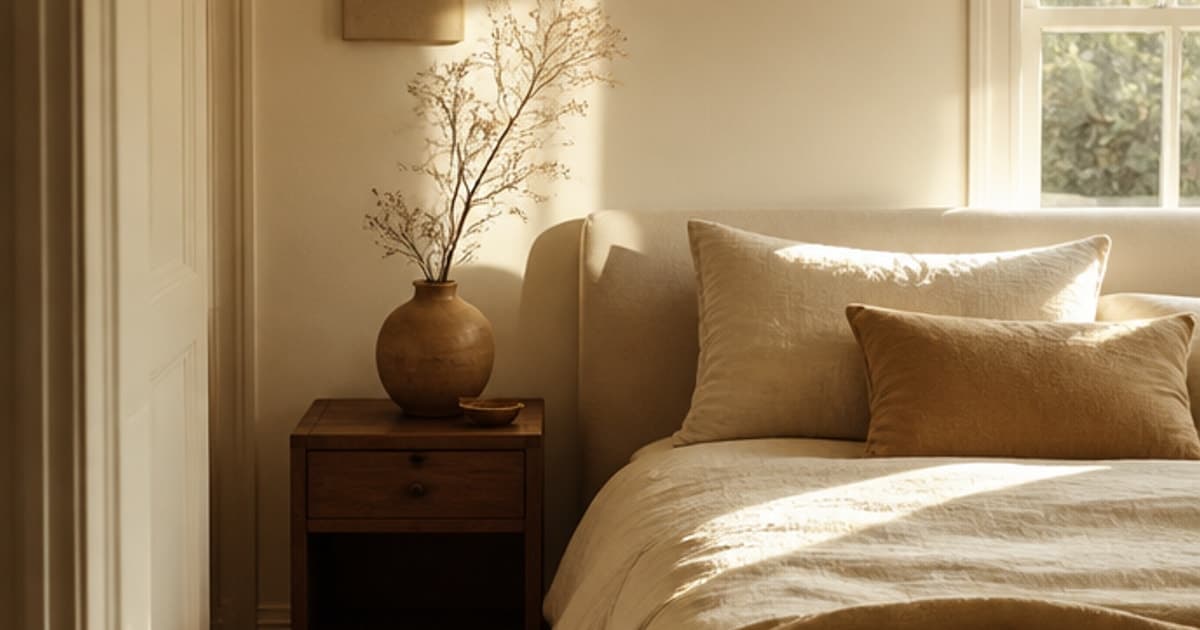
Dover White (SW 6385) is Sherwin-Williams' warm, creamy off-white with a published LRV of 82.52 and a hex of #F0EADC, which is an on-screen approximation of the paint (Sherwin-Williams, read 9 October 2026). Sherwin-Williams lists it for interior and exterior use and calls it "a warm, sun-splashed white."
Here's what makes it unusual. Dover White is bright enough to pass as a trim color and warm enough to work as a wall color, so people keep asking whether it can do both jobs in one room. The numbers say the contrast it makes against Sherwin-Williams' trim whites comes from temperature, not brightness. That changes how you should use it, and we'll show you where.
How yellow is Dover White, really?
Dover White is the yellowest of the six Sherwin-Williams whites compared in this article, with a CIELAB b value of +7.5 on screen, a hair above Creamy at +7.1 and well above Alabaster at +5.2 (RoomCalm calculation from Sherwin-Williams' published hex values, read 9 October 2026). The b axis runs from blue to yellow, so a higher number means more yellow. Its a value is -0.3, which means there's no pink or green pull to worry about.
On its own, it reads as white. Sherwin-Williams calls it "a warm, sun-splashed white," and the RGB values tell the story: red 240, green 234, blue 220. Blue is the one hanging back, and that gap is the cream.
But cream is relative. A plain white mug looks white until you set it beside a new one straight from the box, and Dover White behaves the same way next to a cool white like Snowbound. Keep that in mind before you pair it with anything gray, because that's where most of the complaints about this color come from.
Is Dover White bright enough for a dark or north-facing room?
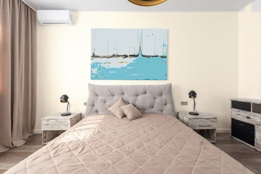
Yes, Dover White is bright enough for a dark or north-facing room: its LRV of 82.52 means it reflects most of the light that reaches it, and Sherwin-Williams suggests warm, higher-LRV colors for north light (Sherwin-Williams, read 9 October 2026). LRV, in Sherwin-Williams' own words, "ranges from 0-100 with zero reflecting no light and 100 reflecting all light."
North-facing rooms, the company says, "receive the least amount of light throughout the day," and it's "best to avoid colors with cool undertones" there and to "look at colors that have a higher LRV." Dover White passes both checks. It's warm, and 82.52 is high.
One honest limit. Paint reflects light; it doesn't make any. In a windowless hallway Dover White will be a brighter cream than Creamy would be, by 1.3 LRV points, and that's the whole of the miracle. Because the room is dim, the yellow in it will also look softer than it does in a sunny kitchen, which is often what people want from a north room anyway.
Where does Dover White's warmth turn into too much?
Dover White tips from warm into plainly yellow under strong south light or warm bulbs, and it tips hardest when it shares a wall with a cool gray or greige. South-facing rooms get "consistent warm light throughout the day," and Sherwin-Williams' advice there is that "you'll need to avoid choosing a color that's too warm" (Sherwin-Williams, read 9 October 2026). Dover White isn't disqualified there. It is the warm white most likely to cross that line.
Bulbs push the same way. "Warm lighting will make a room seem cozier but will typically be a bit dimmer," the company says, and warm light on a warm white adds up. If you've chosen white or cool-toned bulbs instead, Sherwin-Williams says to pick colors as you would for a north-facing room, which brings Dover White back into play.
The bigger trap is the neighbor. Against Snowbound (SW 7004, b +2.8) the yellow gap is about 4.7 b-points, which is about where a warm white starts looking like the pages of an old paperback. East rooms, warm in the morning and cool toward evening according to Sherwin-Williams, will show you both versions in a single day.
If this section describes your room, a white with less yellow in it may be the better call.
The cooler gray-white sibling: Eider White →Can you use Dover White on both the walls and the trim?
Yes, you can use Dover White on both walls and trim, and Sherwin-Williams lists it for interior and exterior surfaces, but the trim won't read as white against those walls; it reads as the same cream in a glossier sheen (Sherwin-Williams, read 9 October 2026). What you get is a wrapped room, where the eye stops noticing where the wall ends and the casing begins.
That look suits rooms with a lot of trim to hide: panelled doors, built-ins, a radiator cover that was never meant to be admired. Painted one color, they settle down. The sheen does the work the contrast would have done, with a flatter finish on the walls and a glossier one on the trim catching the light differently.
Two things to know first. A screen can't show sheen, so our visualizer can't preview the gloss on the casing, and it can't paint the trim on its own. And if your ceilings are already a cool white, Dover White trim will make them look cooler still by comparison, which you may or may not want.
Load Dover White onto a photo of your own room. Free, no sign-up, and the photo stays on your device.
Try Dover White on your room, free →Which trim white gives Dover White walls a crisp edge?
Pure White (SW 7005, LRV 83.957) or Extra White (SW 7006, LRV 85.861) gives Dover White walls a crisp edge, and nearly all of that edge comes from temperature, because the two trims are only 1.4 and 3.3 LRV points brighter than the wall (Sherwin-Williams, read 9 October 2026). On screen, Pure White's b value is +3.0 and Extra White's is +2.3, against Dover White's +7.5.
The line you see between a Dover White wall and a Pure White trim is a change in temperature, not a change in brightness.
That matters when choosing between the two. Sherwin-Williams says Pure White has the "slightest yellow undertone that keeps it from appearing too stark" and to "use on trim"; Extra White's "high light reflectivity makes it an ideal choice for trim and ceilings." Pure White keeps a little warmth in the family, so the edge is clean without being cold. Extra White is the colder cut, and it makes the cream in the walls more visible.
Snowbound (SW 7004, LRV 82.771) is the odd one out. It's barely brighter than Dover White, so the difference reads as a mistake rather than a choice.
Dover White vs Creamy: can anyone see the difference?
Hardly anyone can see the difference between Dover White and Creamy (SW 7012) on a screen: they sit 0.86 apart on our distance scale, under the 2 we label "hard to tell apart," and their LRVs are 82.52 and 81.191, 1.3 points apart (Sherwin-Williams, read 9 October 2026). Dover White is a hair lighter (L 92.8 against 92.2) and a hair yellower (b +7.5 against +7.1).
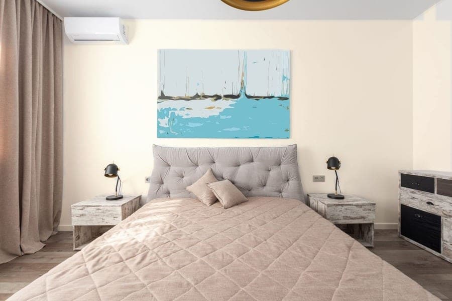
Sherwin-Williams describes Creamy as a bright white with "the softest of yellow undertones." Read those numbers again and you'll see why the two are so often shortlisted together. The gap between them is smaller than the gap between a morning and an afternoon on the same wall.
We haven't painted a board with either, so we'll stop where the numbers stop. Real paint has pigment and sheen that a hex code doesn't carry, and two colors this close can part ways once they're on plaster. If you're torn, this is the one pairing where ordering both chips and letting the room decide costs nothing but a week of looking at the wall.
Dover White vs Alabaster: which warm white fits your room?
Alabaster (SW 7008, LRV 82.215) is the better fit for a room that already has gray in it, and Dover White is the better fit for a room that wants visible cream; on screen they're 2.34 apart, which our scale calls "very close" (Sherwin-Williams, read 9 October 2026). Their lightness is nearly the same (L 92.7 against 92.8), and Dover White sits 0.3 LRV points above Alabaster.
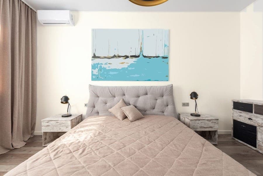
So the whole difference is yellowness. Alabaster's b value is +5.2; Dover White's is +7.5. Sherwin-Williams calls Alabaster a "soft, warm but balanced white," and that word balanced is the useful one. It leans warm without committing. Dover White commits.
Where that plays out is at the edges of the room. With a greige sofa or a gray tile floor, Alabaster keeps the peace and Dover White starts an argument. With oak floors, warm bulbs and no gray in sight, Dover White's extra cream reads as intention, and Alabaster can look a little pale beside it. Neither is wrong. They're answering different questions.
Where does Dover White sit among Sherwin-Williams' warm white paint colors?
Among the six Sherwin-Williams whites compared here, Dover White is the warmest on screen and the third-dimmest: its b value of +7.5 tops the group, and its LRV of 82.52 sits above only Alabaster and Creamy (Sherwin-Williams, read 9 October 2026). The spread in brightness across the whole group is 4.7 LRV points, from Creamy at 81.191 to Extra White at 85.861.
That's a narrow band. The spread in yellowness, from +2.3 to +7.5, is the axis that decides how each of these looks beside the others. Our distance numbers below are CIE76 differences in CIELAB from the published hex values: under 2 is "hard to tell apart," 2 to 5 is "very close," 5 to 10 is "same family," and 10 or more is "no real match." They describe screens. A wall will disagree with them a little, and the wall gets the final word.
| Shade | Code | Hex (on-screen approximation) | LRV (SW) | Distance from Dover White | What that means |
|---|---|---|---|---|---|
| Dover White | SW 6385 | #F0EADC | 82.52 | 0 | The reference |
| Creamy | SW 7012 | #EFE8DB | 81.191 | 0.86 | Hard to tell apart on screen; a touch dimmer |
| Alabaster | SW 7008 | #EDEAE0 | 82.215 | 2.34 | Very close; less yellow |
| Pure White | SW 7005 | #EDECE6 | 83.957 | 4.53 | Very close; cooler, reads as a trim white |
| Snowbound | SW 7004 | #EDEAE5 | 82.771 | 4.76 | Very close; cool, shows the cream in Dover White |
| Extra White | SW 7006 | #EEEFEA | 85.861 | 5.48 | Same family; brightest and coolest here |
| Benjamin Moore White Dove | OC-17 | #F0EDE1 | not read | 1.75 | Hard to tell apart on screen; a different paint |
| Farrow & Ball School House White | No. 291 | #EDE7D5 | not read | 2.37 | Very close on screen; a different paint |
Are Benjamin Moore White Dove and Dover White the same paint?
No, Benjamin Moore White Dove (OC-17) and Sherwin-Williams Dover White (SW 6385) are different paints from different companies, and the only thing they share is a pair of names with the words swapped. On screen they're 1.75 apart, using the hex our catalog stores for White Dove (#F0EDE1), which puts them under our "hard to tell apart" line. We haven't read Benjamin Moore's published LRV for this comparison, so we won't quote one.
That closeness is the reason people mix them up and the reason they shouldn't. A screen match means the two chips are worth ordering together. It doesn't mean a Benjamin Moore store can mix Dover White for you by name, and a painter who hears "White Dove" when you said "Dover White" will come back with the wrong can. Say the code. SW 6385 survives a bad phone line.
Farrow & Ball's School House White (No. 291, #EDE7D5 in our catalog) is the other close neighbor, at 2.37 on screen, and the same caution applies. Order that chip too if it's on your list.
Have a color from another brand you're trying to match? Paste the code or pick it from a photo.
Free paint color matcher →Why the two brands' whites don't line up code for code, and what that means at the counter.
Benjamin Moore vs Sherwin-Williams →Which colors does Sherwin-Williams pair with Dover White?
Sherwin-Williams' own coordinating picks for Dover White are Dakota Wheat (SW 9023, LRV 54.204), a warm tan, and Waterloo (SW 9141, LRV 12.972), a deep blue-gray (Sherwin-Williams, read 9 October 2026). The company's advice is to "bring out its color by pairing it with a more saturated shade like Dakota Wheat," which tells you how it sees this white: as a background that likes company.
The pattern behind those two picks is worth copying. Dakota Wheat (#E1BD8E on screen) shares Dover White's yellow lean and deepens it; Waterloo (#536872) sits on the far side of the wheel and gives the cream something to be warm against. Warm woods do the first job for free. Oak and walnut pull in the direction of that b +7.5, which is why Dover White tends to look settled over wood floors and unsettled over gray tile.
Cool grays and greiges are the ones to test before committing, for the reason in the south-light section. And pin the real chips side by side on a mood board first, because paint behaves differently in company and a board is cheaper than a second coat of regret.
Sticking real chips, fabric and a floor sample on one board before choosing is the cheapest test there is. Here's how we'd lay it out.
The mood board guide →How do you check Dover White on your own walls before buying?
The free way to check Dover White on your own walls is to load it onto a photo of your room in RoomCalm's visualizer, then order Sherwin-Williams' sample chips, because neither settles it alone. The visualizer is free and unlimited with no sign-up, runs in your browser, and the photo never leaves your device.
The limits, stated plainly. It can't show sheen or paint only the trim. And it doesn't work on house exteriors, because the detector doesn't find facade walls; that matters, since Dover White is sold for exteriors too. Outside, you're down to chips.
The optional "Precise" AI repaint of the whole photo is one free a day with no sign-up, five more with the $9 pack, 20 a month on the $15 plan. It's told to leave doors, trim and mirrors alone, which is an instruction rather than a guarantee.
Then the chips: up to 10 free 2 x 3 inch chips, or 8 x 8 inch peel-and-stick samples at $3.95 each, $3.50 when you buy four or more (Sherwin-Williams, read 9 October 2026). Stick one by the trim and one in the darkest corner. Look at breakfast, then again after the lamps come on. That chip gets the last word.
Dover White, loaded and named, on a photo of your room. No account, nothing uploaded.
Try Dover White on your room, free →Once the color is settled, work out the cans before the store does it for you.
How much paint for this room →Quick answers
Is Dover White too yellow?
Dover White isn't too yellow for most rooms, but it is the yellowest of the six Sherwin-Williams whites we compared, with an on-screen b value of +7.5 against +5.2 for Alabaster and +3.0 for Pure White. It shows the most cream in strong south light and next to cool grays. Beside wood floors and warm tans it reads as a soft white, which is how Sherwin-Williams describes it.
What is the LRV of Sherwin-Williams Dover White?
Dover White (SW 6385) has a published LRV of 82.52 (Sherwin-Williams, read 9 October 2026). On Sherwin-Williams' 0 to 100 scale that makes it a light, reflective off-white: 0.3 points above Alabaster (82.215), 1.4 below Pure White (83.957) and 3.3 below Extra White (85.861). It's bright enough for a north-facing room, though no paint adds light a room doesn't have.
Is Dover White good for trim?
Dover White works as trim when the walls are a deeper color, or when walls and trim are both Dover White for a wrapped, single-color look. Next to a cooler or brighter white wall it will read as cream rather than white. Sherwin-Williams points to Pure White (SW 7005) and Extra White (SW 7006) for trim, and those are only 1.4 and 3.3 LRV points brighter than Dover White, so the difference you'd see is mostly warmth.
What's the difference between Dover White and Alabaster?
The difference is almost entirely yellowness: Dover White's on-screen b value is +7.5 and Alabaster's is +5.2, while their brightness is nearly the same (LRV 82.52 against 82.215). On our CIELAB distance scale they sit 2.34 apart, which we call "very close." Alabaster suits rooms with gray or greige in them; Dover White suits rooms with wood and warm light. Test both chips in the room before choosing.
Are Dover White and Benjamin Moore White Dove the same paint?
No, Dover White (Sherwin-Williams SW 6385) and White Dove (Benjamin Moore OC-17) are two different paints whose names are easily swapped. On screen they sit 1.75 apart using the hex values in our catalog, which falls under our "hard to tell apart" line, but that's a reason to order both chips rather than a reason to treat one as the other. Always give the code when ordering.