Journal · By Anas · Updated August 22, 2026 · 7 min read
Sherwin-Williams Accessible Beige SW 7036 — LRV & Review
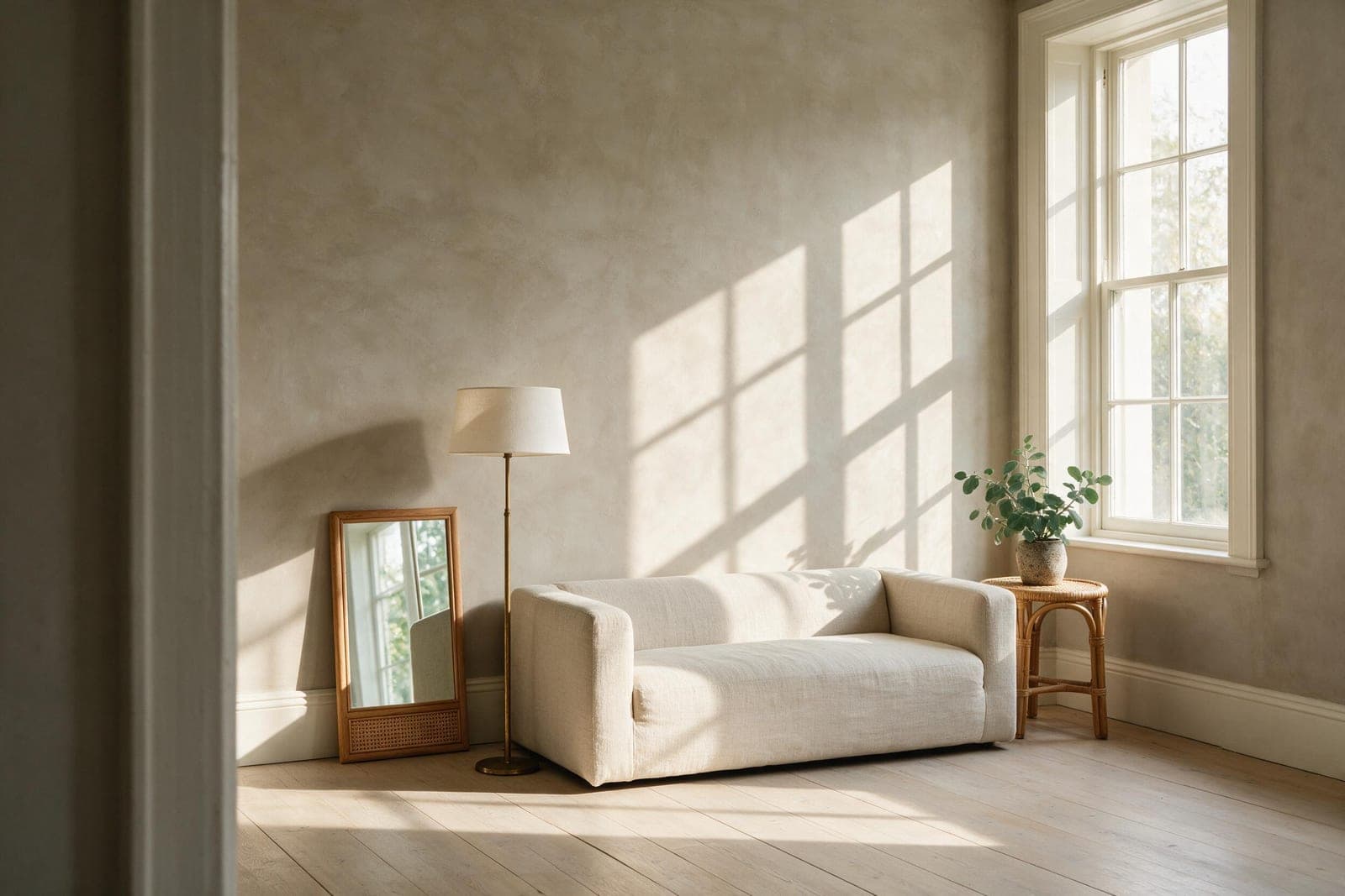
Sherwin-Williams Accessible Beige (SW 7036) is a warm greige with a published LRV of 57.67, and that number is the whole story. It sits almost exactly in the middle of the light scale, which means it is not the pale, airy neutral it looks like on a screen. It reads soft and warm in a bright room and turns noticeably greyer and heavier in a dim one. Here is what the color actually is, where it goes wrong, and the free way to see it on your own walls first.
What color is Accessible Beige, really?
It is a beige with grey mixed into it, which is why everyone files it under greige. Sherwin-Williams' own color data puts it at hex #d1c7b8, or RGB 209 / 199 / 184. That gap between the red channel and the blue channel, 25 points, is the measurable version of what people mean when they say it feels warm. A true grey would have almost no gap at all.
The useful way to place it is on a ladder of neutrals people cross-shop, using Sherwin-Williams' published hex values for each:
- ·Repose Gray (SW 7015), RGB 204 / 201 / 192, red-blue gap of 12. Genuinely grey.
- ·Agreeable Gray (SW 7029), RGB 209 / 203 / 193, gap of 16. Grey with warmth leaking in.
- ·Accessible Beige (SW 7036), RGB 209 / 199 / 184, gap of 25. The warm side of greige.
- ·Kilim Beige (SW 6106), RGB 215 / 197 / 174, gap of 41. A real beige, no argument about it.
So Accessible Beige is the third rung. Warmer than the grays people compare it to, still a long way short of a proper beige. In low or artificial light the grey base steps forward, which is the source of the complaint you see over and over in reviews: that it went flat, or looked slightly dirty, or lost its warmth after dark.
What is the LRV of Accessible Beige, and why does it matter?
LRV, or Light Reflectance Value, runs from 0 to 100 and tells you how much light a color throws back into the room. Accessible Beige is published at 57.67, which nearly everyone rounds to 58. It reflects a bit over half the light that hits it.
Here is where the misreading happens. People shortlist Accessible Beige next to whites and assume it belongs in the same family. It does not. Alabaster (SW 7008) sits at 82.22. Pure White (SW 7005) is at 83.96. Accessible Beige is roughly 25 points below both. When you paint the walls in it and keep white trim, that difference is exactly why the trim suddenly looks brighter than you expected and the wall looks darker than the sample card promised.
In practice that means it needs light. In a south-facing room with good windows it holds its warmth all day and looks like the photos. In a north-facing room, or a hallway with one ceiling fitting, 57.67 is not enough reflectance to carry the space and the grey base takes over.
Accessible Beige vs Repose Gray: the comparison that surprises people
This is the shortlist that eats weeks of people's lives, and the numbers settle most of it. Repose Gray's published LRV is 58.22. Accessible Beige is 57.67. They are half a point apart.
Which means lightness is not the deciding factor, whatever the sample cards suggest. Both reflect essentially the same amount of light and will darken or lift a room to the same degree. The only real difference between them is temperature: Accessible Beige leans warm and slightly earthy, Repose Gray stays cool and grey. Pick on the undertone, on what your floors and fixed finishes are doing, and stop weighing them by lightness. They are the same brightness.
If you want the same warmth but deeper, Balanced Beige (SW 7037) is the next number up in the fan deck and drops to an LRV of 45.6. That is a real step down, not a nudge. Push further into green-leaning warmth and you reach Universal Khaki, which reads far darker on a wall than its swatch suggests.
What colors go with Accessible Beige?
Sherwin-Williams publishes its own coordinating set for every color, and the one for Accessible Beige is worth knowing because it is not what the pinned palettes show:
- ·Aesthetic White (SW 7035), LRV 73.10. This is Sherwin-Williams' own recommended white partner, and it is a soft off-white rather than the bright Alabaster most people reach for. The 15-point gap keeps trim clearly lighter without the jolt.
- ·Sanderling (SW 7513), LRV 31.38. A deeper warm neutral for cabinetry, a built-in, or an accent wall.
- ·Cadet (SW 9143), LRV 31.22. A muted blue, which is the surprise in the set. Almost no Accessible Beige palette online will show you a blue, and it works because the grey in the beige gives the blue something to hold on to.
Beyond the official set, the safe partners are the warm mid-neutrals that sit near it without competing: Natural Linen (SW 9109, LRV 66.33) for a lighter adjoining room, or Urbane Bronze (SW 7048, LRV 8.12) when you want a genuinely dark anchor on a door or a fireplace. For materials, it is happiest with oak, rattan, unbleached linen and warm metals. Chrome and cool blue-whites tend to expose the grey in it.
Building a whole-room shortlist rather than picking one wall? Ten calming shades with their published LRVs, pale through deep.
The calming bedroom colors guide →Where Accessible Beige works, and where it does not
- ·Works: open-plan living and dining with decent daylight, where its warmth stops a large space feeling cold.
- ·Works: whole-house neutral in a bright home. Sherwin-Williams lists it in both their Top 50 Interior and Top 50 Exterior color collections, and it turns up in the Pottery Barn Kids and Pottery Barn Teen ranges, which tells you how safely it plays with other things.
- ·Works: kitchens with warm wood or cream cabinets, where a cooler grey would fight the cabinetry.
- ·Struggles: north-facing rooms, where the grey base dominates and the warmth you chose it for disappears.
- ·Struggles: rooms with cool LED lighting. If your bulbs are 4000K or above, this color will not look like the photos. Warm bulbs around 2700K are doing half the work in every flattering picture you have seen of it.
- ·Struggles: as a backdrop to cool grey flooring or blue-grey tile, where it can read slightly pink or muddy by contrast.
The lighting point deserves more weight than it usually gets. A mid-LRV color and a badly lit room is the combination behind most repaints. If you want the actual math on how many lumens a room your size needs, we published the rulebook we work from, clearances and lighting standards included.
The designer rules behind the advice above, cited to their sources: LRV, lighting levels, clearances, the 60-30-10 split.
Read the method →How can I see Accessible Beige on my own walls before buying?
Shortlist on a photo, decide with a tester pot. Upload a picture of your room and repaint the walls in a warm greige like this one right in your browser. It is free, unlimited, and the photo stays on your device. In about ten seconds it answers the question that actually matters, which is whether your room's light can carry an LRV of 58 or whether it will pull the grey forward.
It will not replace a tester pot for the final call. No screen shows paint accurately, this page included. What it will do is stop you buying three sample pots for colors your room was never going to hold. And if you are still deciding on the brand before the shade, we have put Benjamin Moore vs Sherwin-Williams side by side.
Repaint your own walls in a warm greige, free, in your browser, no sign-up.
Try it on my walls →Or see the whole room done: upload one photo and get your real room redesigned around a neutral like this, your furniture kept where it is.
Redesign my room free →Want the opposite end of the scale? The same honest treatment of a deep earthy olive at LRV 20.
Olive Grove SW 7734 reviewed →Universal Khaki is the warmer, deeper neutral people cross-shop against this one — reviewed the same way, with its published LRV and the rooms it lets down.
Universal Khaki SW 6150 reviewed →Honesty footer: every LRV and hex value above comes from Sherwin-Williams' published color data, and screen previews are always approximations. Shortlist on screen, then paint a large swatch and look at it in the morning and again after the lamps go on. A mid-tone neutral changes more between those two moments than a dark color does.
Quick answers
What is the LRV of Sherwin-Williams Accessible Beige?
Accessible Beige has a published LRV of 57.67, usually rounded to 58. That puts it in the middle of the 0 to 100 scale, so it reflects a little over half the light that reaches it and behaves as a mid-tone rather than a light neutral.
What are the undertones of Accessible Beige?
Accessible Beige is a warm beige with a grey base, which is why it is classed as a greige. Its published hex of #d1c7b8 gives a 25-point gap between the red and blue channels, warmer than Repose Gray or Agreeable Gray but well short of a true beige like Kilim Beige. In dim or cool light the grey base becomes more obvious.
What is the difference between Accessible Beige and Repose Gray?
Temperature, almost entirely, because their lightness is nearly identical. Repose Gray's published LRV is 58.22 and Accessible Beige's is 57.67, a difference of half a point. Accessible Beige leans warm and earthy while Repose Gray stays cool and grey, so choose between them on undertone and on your fixed finishes, not on which looks lighter.
What white trim goes with Accessible Beige?
Sherwin-Williams' own recommended white partner is Aesthetic White (SW 7035) at an LRV of 73.10, a soft off-white. Brighter whites like Alabaster (LRV 82.22) or Pure White (LRV 83.96) also work but sit around 25 points above the walls, so the contrast is much sharper and the wall will read darker by comparison.
How can I test Accessible Beige before I buy the paint?
Repaint a photo of your own room in a free browser visualizer first, then buy a tester pot for your finalist. RoomCalm's paint color visualizer repaints your walls on your own photo with no sign-up and the image never leaves your device, which is enough to tell you whether your room's light can carry a mid-tone neutral before you spend anything.