By Anas · Updated October 10, 2026 · 9 min read
Drift of Mist by Sherwin-Williams: the light greige in the gap
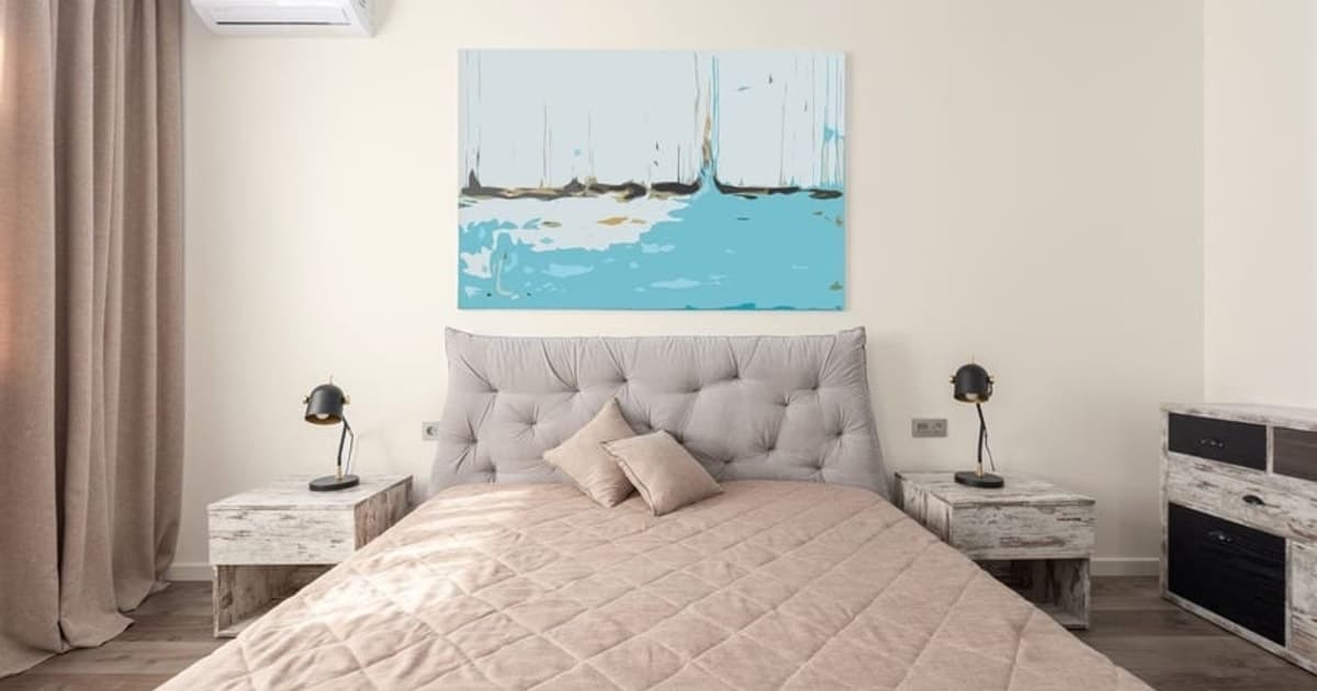
Straight answer first: Sherwin-Williams Drift of Mist (SW 9166) is a light, warm-leaning gray, the kind most people call a greige, with a published LRV of 69.14 (Sherwin-Williams, read 10 October 2026) and a hex of #DCD8D0 as an on-screen approximation. Sherwin-Williams files it under Neutral, flags it for interior and exterior use, and names it for rooms that lack natural light. It suits anyone who tried Agreeable Gray and found it a shade too heavy, or tried an off-white and found it a shade too close to nothing.
Here's the thing about this color. The popular Sherwin-Williams greiges sit around LRV 58 to 60, and its nearest off-whites, City Loft and Eider White, start at 70. Drift of Mist lands at 69, in the gap. That gap is the whole article: what the extra nine points over Agreeable Gray buy you, how close it comes to City Loft, and the rooms where it's the wrong pick.
Is Drift of Mist a gray, a greige or an off-white?
Drift of Mist is a greige: Sherwin-Williams calls it a gray, its published hex leans a little warm, and its LRV of 69.14 stops just short of the off-whites. The brand's own line is "This airy, inviting gray feels just right in any space. An ideal neutral that won't appear too dark in areas lacking natural light." (Sherwin-Williams, read 10 October 2026). The published values are hex #DCD8D0 and RGB 220 / 216 / 208, so red sits four points above green and green eight above blue. Convert that hex to Lab and you get roughly L 86.4, a -0.03, b +4.41, our own on-screen calculation: almost no red or green lean and a small yellow one. That's what greige means in numbers. For scale, Agreeable Gray's b is +5.71, so Drift of Mist carries less beige than the best-seller, not more. And at 69.14 it sits 1.3 LRV points under City Loft (70.468), which Sherwin-Williams calls an off-white. It's the lightest gray in the family that still admits to being gray. If the paint counter asks, say warm gray and nobody will argue.
Why does Sherwin-Williams point dim, north-facing rooms toward Drift of Mist?
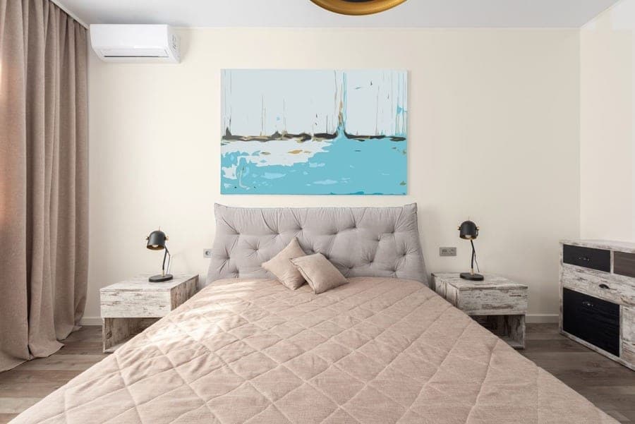
Sherwin-Williams points dim, north-facing rooms toward Drift of Mist because its LRV of 69.14 clears the 60 LRV floor the brand sets for pushing back against the blue light those rooms get. Its neutral paint colors page says it plainly: "To counteract the blue light in north facing rooms, look for a paint that has a 60 LRV or higher." It then names three colors, Rivers Edge (SW 7517), Drift of Mist (SW 9166) and Olympus White (SW 6253) (Sherwin-Williams, read 10 October 2026). The same page puts a crisp, airy neutral "typically between 50-60 LRV", with Grayish (SW 6001), Front Porch (SW 7651) and Worldly Gray (SW 7043) as examples, and warns that dark neutrals "may not work in a room with little natural light." Drift of Mist clears the north-room bar by about nine points, which is margin rather than luck. Because north light is blue, the small yellow lean in the hex (b +4.41) helps too; it gives cool light something to warm up instead of a dead-neutral gray that simply goes cold. It won't make the room bright. It will stop the walls from making it darker.
What do the nine extra LRV points over Agreeable Gray actually buy you?
The nine extra LRV points mean a Drift of Mist wall sends back roughly 69 percent of the light that reaches it where an Agreeable Gray wall sends back roughly 60, and in a dim room that's the gap between a wall that reads light gray and one that reads mid gray. The published figures are 69.14 against 60.386 (Sherwin-Williams, read 10 October 2026). On screen the lightness gap is L 86.4 against L 81.9, and the warmth shifts a little too: Agreeable Gray's b of +5.71 is yellower than Drift of Mist's +4.41, so stepping up also drops a touch of beige. Our distance between the two hexes is 4.74, which we call "very close". Here's what the nine points don't buy. They don't change the character of the color; both are warm-leaning grays from the same shelf, and in a bright south room the difference mostly vanishes into the daylight, where both look pale. Nine points is one notch on a dimmer, not a new lamp. What it does buy is a wall that steps back in a room already short of light, and a lower risk of the walls going muddy after dark.
Drift of Mist vs Agreeable Gray: which one should you pick?
Pick Drift of Mist when the room is dim or you want the walls to step back, and pick Agreeable Gray when the room is bright and you want the walls to read as a color in their own right. Sherwin-Williams calls Agreeable Gray "Our best-selling paint color" and says that "with a beige undertone, this gray exudes a subtle warmth" (Sherwin-Williams, read 10 October 2026). That warmth is the point of it. In a south-facing living room it reads as a soft, settled greige that holds its own against a sofa. Put the same can in a north-facing bedroom and it can look heavy, the way a gray coat looks fine outdoors and gloomy on a hook in the hall. Drift of Mist is the lighter cousin with a bit less beige and a lot more light. The two sit 4.74 apart on screen, "very close", so you're choosing a weight rather than a different color. If you want to see how either one sits in a full palette, Color Studio is where you can build a whole-home palette around either one. Then buy both chips and tape them to the darkest wall, 7am and 10pm. The wall will vote.
Can't decide between the two? Open the visualizer with Drift of Mist loaded, then swap in Agreeable Gray on the same photo of your room. Free, no sign-up.
Try Drift of Mist on your room, free →Is City Loft just a lighter Drift of Mist?
On a screen City Loft is close to a lighter Drift of Mist, 0.99 apart on our distance scale and 1.3 LRV points brighter, but Sherwin-Williams describes their undertones differently, and that's the part a hex can't show. City Loft (SW 7631) is #DFDAD1 with a published LRV of 70.468; Drift of Mist is #DCD8D0 at 69.14 (Sherwin-Williams, read 10 October 2026). On screen the lightness is L 87.2 against L 86.4, less than a point. Sherwin-Williams itself lists City Loft among Drift of Mist's similar colors. But the brand calls City Loft a "warm off-white with beige and red undertones" and Drift of Mist an "airy, inviting gray", and Drift of Mist's a value of -0.03 shows no red lean at all on screen. A hex code carries none of that pigment story. Real paint does. So treat 0.99 as "hard to tell apart on a screen", our scale word for anything under 2, and not as a promise about plaster. The practical question is which word you want to say when a guest asks: gray or off-white. If it's off-white, City Loft. If gray, you're already here.
Is Repose Gray a darker version of Drift of Mist?
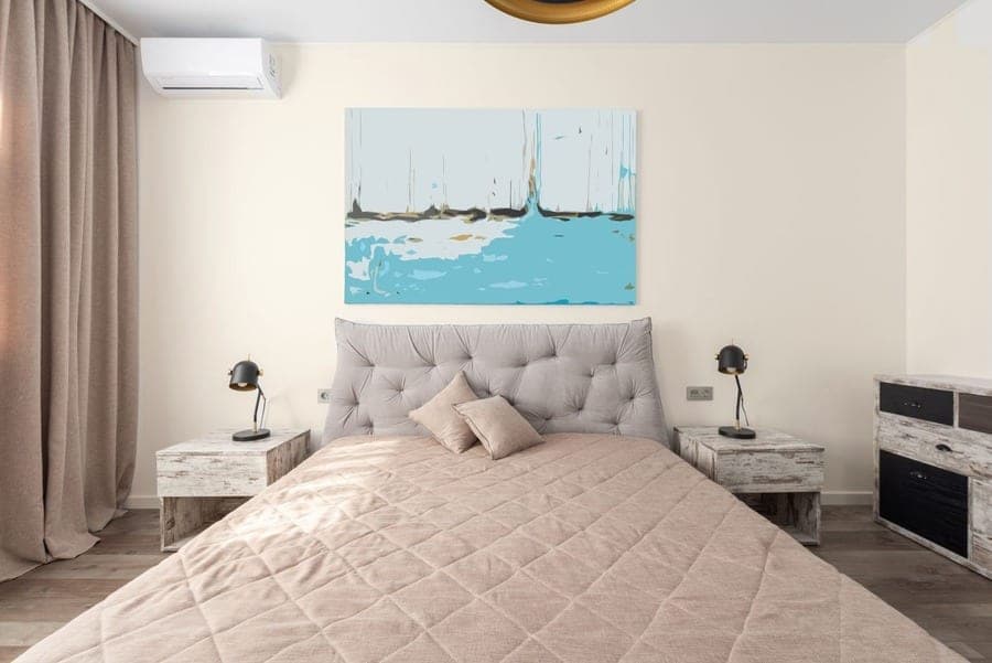
Repose Gray is close to a darker Drift of Mist: the two sit 5.52 apart on our on-screen scale, which we call "same family", and almost 11 LRV points apart, 69.14 against 58.22, so Repose Gray is the clearly darker of the two (Sherwin-Williams, read 10 October 2026). Repose Gray (SW 7015) is #CCC9C0, L 81.0 on screen with a b of +4.85, close to Drift of Mist's +4.41. The gap is almost all lightness. Sherwin-Williams' tip for Repose Gray is "For a complementary trim, pair with Eider White", and Eider White is also on Drift of Mist's coordinating list, so the two share a trim. We looked at Repose Gray against Accessible Beige elsewhere, and the pattern holds: Repose Gray reads as a color on the wall, Drift of Mist reads as a background. If you fell for Repose Gray in a friend's bright kitchen and yours faces north, Drift of Mist is the honest translation. The table below uses our scale words: under 2 "hard to tell apart", 2 to 5 "very close", 5 to 10 "same family", 10 or more "no real match". The two other-brand hex values come from RoomCalm's catalog, not from those brands' sites.
| Shade | Code | Hex (on-screen approximation) | LRV (SW) | Distance from Drift of Mist | What that means |
|---|---|---|---|---|---|
| City Loft | SW 7631 | #DFDAD1 | 70.468 | 0.99 | Hard to tell apart on screen; SW calls it an off-white with beige and red undertones |
| Eider White | SW 7014 | #E2DED8 | 73.219 | 2.42 | Very close; lighter, SW's own coordinating white |
| Gossamer Veil | SW 9165 | #D3CEC4 | 61.829 | 3.73 | Very close; the darker step on the same strip |
| Agreeable Gray | SW 7029 | #D1CBC1 | 60.386 | 4.74 | Very close; darker and a touch more beige |
| Repose Gray | SW 7015 | #CCC9C0 | 58.22 | 5.52 | Same family; clearly darker, similar warmth |
| Alabaster | SW 7008 | #EDEAE0 | 82.215 | 6.32 | Same family; much lighter, the trim-white step up |
| Pale Oak (Benjamin Moore) | OC-20 | #DDD6CA | n/a (catalog hex) | 2.45 | Very close; a touch more yellow on screen |
| Cornforth White (Farrow & Ball) | No. 228 | #CFCABF | n/a (catalog hex) | 5.28 | Same family; darker on screen |
What colors does Sherwin-Williams pair with Drift of Mist?
Sherwin-Williams pairs Drift of Mist with Eider White (SW 7014), Polished Concrete (SW 9167) and Perle Noir (SW 9154), and its February 2024 Color of the Month page adds Western Reserve (SW 9597), Quarry Stone (SW 9603), Prelude (SW 9620), Studio Beige (SW 9602), Skyline Steel (SW 1015) and Pure White (SW 7005) (Sherwin-Williams, read 10 October 2026). The first trio is a ladder: a lighter white for trim (Eider White, LRV 73.219), a mid gray (Polished Concrete, #9E9793) and a near-black (Perle Noir, #4F4D51). One honest note on that trim. Eider White is only about four LRV points above Drift of Mist and 2.42 away on screen, so the edge between wall and casing will be soft rather than crisp; Eider White is a gray-undertone white built for this kind of company. Pure White is on the Color of the Month list if you'd rather the trim announce itself. For a darker wall in the same mood, the next step on strip 238 is Gossamer Veil (SW 9165, LRV 61.829), which Sherwin-Williams calls a "cool, mist-gray neutral" for bedrooms and family rooms, 3.73 from Drift of Mist on screen. It's a quiet household, where nobody raises their voice.
Where does Drift of Mist look flat or dingy?
Drift of Mist looks flat or dingy in a dim, north-facing room lit by cool bulbs, because an LRV of 69.14 can only return the light the room already has, and cool light pulls a near-neutral gray toward plain gray. The 60 LRV rule is sound; it just isn't magic. Its warmth is small, b +4.41, and its a of -0.03 means there's no pink or red to help the way Sherwin-Williams says there is in City Loft. Under cool white bulbs after dark, the wall can go the color of a filing cabinet.
No paint adds light a room doesn't have.
The other place it turns dingy is beside a much brighter trim. Alabaster (SW 7008) sits at LRV 82.215, about 13 points above Drift of Mist, and against that much contrast a soft greige can read grubby rather than warm. And a screen can't show how the color shifts between breakfast and the lamps coming on. We haven't painted a board in it. If you'd rather have cream than gray, Dover White is the warmer road. Otherwise, put a sample on the darkest wall and judge it at night with your own bulbs.
Is there a Benjamin Moore or Farrow & Ball color close to Drift of Mist?
The closest Benjamin Moore color to Drift of Mist in our catalog is Pale Oak (OC-20), 2.45 away on screen, which our scale calls "very close", and the closest Farrow & Ball is Cornforth White (No. 228) at 5.28, "same family". Both distances come from the hex values stored in RoomCalm's catalog, #DDD6CA for Pale Oak and #CFCABF for Cornforth White, which we did not read from those brands' sites today; that's why the table says "n/a (catalog hex)" for their LRVs rather than a guess. On screen Pale Oak is L 85.9 with a b of +6.76, a touch more yellow than Drift of Mist's +4.41 at nearly the same lightness. Cornforth White is L 81.4, clearly darker, closer in weight to Agreeable Gray than to Drift of Mist. Neither is a stand-in for SW 9166, because the two brands' lines don't line up code for code. What a 2.45 means in practice is that the two chips are worth ordering together. Hold them in the window at midday, then by the lamp at night. Two chips beat any number on this page, ours included.
Have a code from another brand? Paste it, or a hex, and the matcher ranks the closest shades in our catalog. Free.
Find the closest match in other brandsHow can you try Drift of Mist on a photo of your room before buying a sample?
You can try Drift of Mist on a photo of your room for free with RoomCalm's paint visualizer; the link below opens it with SW 9166 already loaded and named. It's free and unlimited, needs no sign-up, runs in your browser, and the photo never leaves your device. What you get is an on-screen approximation in your room's own light: whether your window makes Drift of Mist read as soft gray or near-white. In October 2026 we added a box where you can paste any 6-digit hex code and repaint the walls in it. We're still improving it; ornate cornices and moldings can catch paint at the ceiling line. It can't show sheen or paint only the trim, and it doesn't work on exteriors.
One last honesty note. Every number above is Sherwin-Williams' published data or our own screen calculation. The number to remember is 69.14: about nine points above Agreeable Gray, 1.3 below City Loft, and clear of the 60 LRV line Sherwin-Williams draws for north-facing rooms. Whether that lands as soft gray or near-white on your wall is something no page can tell you, because no page has stood in your room after dark.
Upload a photo of your room and see Drift of Mist on your own walls. Free, unlimited, no sign-up, and the photo stays on your device.
Try Drift of Mist on your room, free →Already know the room? Work out how many gallons your walls will take before you buy.
How much paint for this roomWant the lighter, cooler sibling? Eider White is Sherwin-Williams' own coordinating white for Drift of Mist, and it has a story of its own about light direction.
Eider White SW 7014 reviewedQuick answers
What is the LRV of Drift of Mist?
Drift of Mist (SW 9166) has a published LRV of 69.14 (Sherwin-Williams, read 10 October 2026). That puts it about nine points above Agreeable Gray (60.386), 1.3 below City Loft (70.468) and about four below Eider White (73.219), and clear of the 60 LRV line Sherwin-Williams draws for north-facing rooms.
Is Drift of Mist warm or cool?
Drift of Mist leans slightly warm on screen: its published hex #DCD8D0 converts to a b value of +4.41, a small yellow lean, and an a of -0.03, no red or green lean, and Sherwin-Williams calls it an airy gray. It carries less beige than Agreeable Gray (b +5.71). In cool north light that small warmth helps; under cool bulbs at night it can read as plain gray.
Is Drift of Mist lighter than Agreeable Gray?
Yes, Drift of Mist is lighter than Agreeable Gray by about nine LRV points, 69.14 against 60.386 (Sherwin-Williams, read 10 October 2026). On screen the two are 4.74 apart, which we call "very close", so the difference is weight rather than character: Drift of Mist steps back, Agreeable Gray reads as a color.
What white trim goes with Drift of Mist?
Sherwin-Williams lists Eider White (SW 7014, LRV 73.219) as a coordinating color for Drift of Mist, and its February 2024 Color of the Month page lists Pure White (SW 7005). We haven't tested either on a wall. Eider White is only about four LRV points brighter, so the edge will be soft; Pure White is the pick if you want the trim to stand out more.
Is there a Benjamin Moore equivalent to Drift of Mist?
The closest Benjamin Moore color in RoomCalm's catalog is Pale Oak (OC-20), 2.45 from Drift of Mist on screen, which our scale calls "very close" and which is still a different paint, a touch more yellow. That distance uses the hex our catalog stores (#DDD6CA), not a value read from Benjamin Moore today. Order both chips and compare them in your room.