Journal · By Anas · Updated August 22, 2026 · 8 min read
Sherwin-Williams Pewter Green SW 6208 — LRV, Undertones, Review
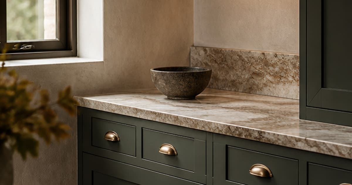
Sherwin-Williams Pewter Green (SW 6208) is a dark, heavily muted green-grey with a published LRV of 11.83. That number is much lower than most people expect, and it is the reason this color behaves so differently in a real kitchen than it does in the photos that sold you on it. It is closer in depth to a charcoal than to a sage. Here is what the color actually is, according to Sherwin-Williams' own published data, where it goes wrong, and the free way to see it on your own walls before you commit.
What color is Pewter Green, really?
Everyone describes it as a grey-green, which is right but not useful. The useful version is in the numbers. Sherwin-Williams publishes Pewter Green at hex #5e6259, or RGB 94 / 98 / 89. Look at how small those gaps are. The green channel sits four points above red and nine above blue. For comparison, Hunt Club (SW 6468) runs 42 / 79 / 67, where green is thirty-seven points above red. That is what an unambiguous green looks like in the same data.
So Pewter Green is barely green at all. It is a near-neutral dark that happens to lean green, which is exactly why it reads as sophisticated rather than loud, and also why people describe it so inconsistently. Some see sage, some see grey, a few insist there is blue in it. They are all looking at a color with almost no chroma left, and a color with almost no chroma takes its character from whatever light is in the room.
That is the part worth internalising. A saturated green looks green everywhere. Pewter Green does not have enough pigment strength to insist on itself. Under a warm 2700K bulb it drifts olive. Under north light or a cool 4000K LED it goes grey and slightly cold. The color did not change; there was never enough green in it to hold a position.
What is the LRV of Pewter Green, and why does it matter?
LRV, or Light Reflectance Value, runs from 0 to 100 and measures how much light a surface throws back. Pewter Green's published figure is 11.826, normally quoted as 11.8. It reflects under an eighth of the light that reaches it.
Put that next to the colors people actually cross-shop it with and the gap is startling. Evergreen Fog (SW 9130), the shade most often mentioned in the same breath, sits at 30.402. That is nearly three times the reflectance. Sea Salt (SW 6204) is at 63.233. Pewter Green is not a slightly deeper version of those. It is a different category of color, and it sits much nearer the dark end: Urbane Bronze (SW 7048) is 8.121 and Iron Ore (SW 7069) is 5.55.
Here is the practical consequence nobody mentions in the mood boards. When you paint a full run of kitchen cabinets in something with an LRV of 11.8, those doors stop returning light to the room. Cabinet fronts are usually the largest continuous surface in a kitchen after the walls, and you have just made them absorb close to ninety percent of everything that lands on them. Kitchens painted this color and lit like they were still white are the single most common regret in the reviews.
The rules behind that lighting claim, cited to their sources: lumen targets per room size, clearances, LRV, the 60-30-10 split.
Read the method →Pewter Green vs Rosemary: how close is too close?
This is the shortlist people get stuck on, and the numbers explain why it feels impossible. Rosemary (SW 6187) has a published LRV of 13.561 against Pewter Green's 11.826. Under two points apart. In the brand's own color data, Rosemary is one of the ten colors listed as similar to Pewter Green.
The real difference is temperature, and it is small but consistent. In Lab values, Rosemary's green axis reads -4.6 and its yellow axis +6.7; Pewter Green reads -3.4 and +4.6. Translated: Rosemary is slightly greener and slightly warmer, so it leans a touch more herbal. Pewter Green is more neutral and a shade cooler. Sampled side by side on a wall, most people can tell them apart. Sampled a week apart from memory, nobody can.
If you want a genuinely different result rather than a different name, move along the depth scale instead of sideways. These four all sit on the same Sherwin-Williams color strip, 217-C, which means they are built from the same base and are guaranteed to sit together:
- ·Sea Salt (SW 6204), LRV 63.233. The pale end of the family, and one of the brand's most-used colors.
- ·Comfort Gray (SW 6205), LRV 53.79. Still light, noticeably more grounded.
- ·Retreat (SW 6207), LRV 20.869. The mid-tone. If Pewter Green feels too heavy for your room, this is the answer you are looking for and almost nobody suggests it.
- ·Pewter Green (SW 6208), LRV 11.826. Dark.
- ·Ripe Olive (SW 6209), LRV 6.162. Nearly black in most light.
I find that strip more useful than any curated palette online. Sea Salt on the walls with Pewter Green on the cabinets is not a lucky combination someone discovered on Pinterest. They are the same color at two depths, which is why it works every single time.
What colors go with Pewter Green?
Sherwin-Williams publishes an official coordinating set for each color, and Pewter Green's is more restrained than the palettes you will find elsewhere:
- ·Shoji White (SW 7042), LRV 74.345. The recommended companion, a soft warm off-white. Its warmth is what keeps the pairing from going cold and institutional.
- ·Silvermist (SW 7621), LRV 46.944. A muted blue-grey for a mid-tone, and the piece most people miss when they build their own palette.
- ·Spare White (SW 6203), LRV 77.307. The recommended trim white. Note that it is a soft white with a slight green-grey cast, not a bright one.
That white choice deserves a second look. Spare White at 77.3 against walls at 11.8 is a gap of more than sixty-five points, which is already dramatic. Reach past it for something like Pure White (SW 7005) at 83.957 and you push the contrast further still, which can start to look like a graphic rather than a room. If your trim is already a bright white and you are painting cabinets rather than walls, that is usually fine. If you are painting a whole room in Pewter Green, the softer white is the safer call.
For materials, this color has an obvious best friend list: unlacquered brass, aged bronze, white oak, walnut, honed marble with warm veining, and unbleached linen. Chrome and cool stainless work but tend to make the grey side of it step forward. Warm metals pull the green out.
Building a whole shortlist rather than picking one shade? Ten calming colors with their published LRVs, pale through deep.
The calming bedroom colors guide →Where does Pewter Green work, and where does it fail?
- ·Works: kitchen and bathroom cabinetry, which is what made it famous. On lower cabinets especially, with a lighter wall above, the depth reads as grounding rather than heavy.
- ·Works: built-ins, a library wall, an office with bookshelves. Dark colors flatter joinery because the shadows and the paint agree with each other.
- ·Works: a well-lit room where you want a color that behaves like a neutral but is not beige. Sherwin-Williams lists it in the Pottery Barn range and the Naturalist collection, which tells you how safely it plays with wood and natural fibers.
- ·Works: an exterior. It is flagged as an exterior color in the brand's data, and outdoors the enormous available light solves the LRV problem for you.
- ·Struggles: a small north-facing room painted floor to ceiling. At 11.8 reflectance with weak cool light, the color loses its green entirely and reads as flat grey.
- ·Struggles: kitchens where the only lighting is a couple of ceiling fittings. This is a color that needs under-cabinet lighting to be a real part of the plan, not an afterthought.
- ·Struggles: alongside cool grey-blue tile or cold LED strip lighting, where the last of the warmth gets stripped out of it.
One more thing about the photographs. Almost every image that made you want this color was taken in a kitchen with a wall of windows, warm bulbs, and a photographer who lit it properly. That is not deception on anyone's part, it is just how interiors get shot. But it means the pictures are showing you Pewter Green under near-ideal conditions, and an LRV of 11.8 is much less forgiving than the picture implies.
How can I see Pewter Green on my own walls before buying?
Shortlist on a photo, then decide with a tester pot. Upload a picture of your room and repaint the walls in a deep green-grey right in your browser. It is free, unlimited, no sign-up, and the photo stays on your device. It takes about ten seconds and answers the only question that matters here, which is whether your room has enough light to carry a color this dark or whether it will go grey and flat on you.
It will not replace a sample. No screen renders paint accurately, this page included, and dark colors are the hardest of all to judge on a display. What a preview does is stop you buying tester pots for colors your room was never going to hold.
Repaint your own walls in a deep green-grey, free, in your browser, no sign-up.
Try it on my walls →Or see the whole room done: upload one photo and get your real room redesigned around a color like this, your own furniture kept where it is.
Redesign my room free →Want the same honest treatment of a warm mid-tone? Accessible Beige, and why its LRV surprises people in the other direction.
Accessible Beige SW 7036 reviewed →Honesty footer: every LRV, hex and Lab value above comes from Sherwin-Williams' published color data, and I have not painted a board in this color. Screen previews are approximations. Shortlist on screen, then paint a large swatch, and look at it once in daylight and again after the lamps come on. With a color this dark the evening reading is the one that decides whether you keep it.
Quick answers
What is the LRV of Sherwin-Williams Pewter Green?
Pewter Green has a published LRV of 11.826, usually quoted as 11.8. On the 0 to 100 scale that makes it a genuinely dark color, reflecting under an eighth of the light that hits it, and much closer to Urbane Bronze at 8.121 than to Evergreen Fog at 30.402.
What are the undertones of Pewter Green?
Pewter Green is a dark green-grey with very little chroma, which is why its undertone shifts with the light. Its published hex of #5e6259 puts the green channel only four points above red, so there is far less green in it than the name suggests. Warm bulbs pull it toward olive and cool or north light pushes it toward plain grey.
What is the difference between Pewter Green and Rosemary?
Very little, and their lightness is nearly identical. Rosemary (SW 6187) has a published LRV of 13.561 against Pewter Green's 11.826, under two points apart, and Sherwin-Williams lists Rosemary among the colors similar to Pewter Green. Rosemary is marginally greener and warmer in its Lab values, so it reads a touch more herbal, while Pewter Green stays more neutral.
Is Pewter Green a good color for kitchen cabinets?
Yes, provided you upgrade the lighting at the same time. It is one of the most-used cabinet colors for good reason, but at an LRV of 11.8 a full run of doors absorbs close to ninety percent of the light reaching it, so under-cabinet lighting needs to be part of the plan rather than something you add later. It is most forgiving on lower cabinets with a lighter wall above.
What white goes with Pewter Green?
Sherwin-Williams recommends Spare White (SW 6203) at an LRV of 77.307 as the trim partner, and Shoji White (SW 7042) at 74.345 as the coordinating off-white. Both are soft whites rather than bright ones, which keeps a very large contrast gap from looking harsh. A bright white like Pure White at 83.957 works on cabinetry but can look severe across a whole room.
How can I test Pewter Green before I buy the paint?
Repaint a photo of your own room in a free browser visualizer first, then buy a tester pot for your finalist. RoomCalm's paint color visualizer repaints your walls on your own photo with no sign-up and the image never leaves your device, which is enough to show you whether your room's light can carry a color this dark before you spend anything.