Journal · By Anas · Updated August 22, 2026 · 8 min read
Sherwin-Williams Universal Khaki SW 6150 - LRV & Undertones
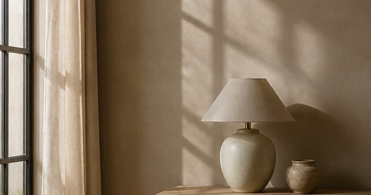
Sherwin-Williams Universal Khaki (SW 6150) is a mid-tone warm neutral with a published LRV of 40.478, and it is the brand's 2026 Color of the Year. Two things surprise people once they look at the actual numbers. It is considerably darker than the launch photography suggests, sitting seventeen points below Accessible Beige. And the olive undertone everyone repeats does not exist in the brand's own color measurements, which put it fractionally on the red side of neutral. Here is what the color really is, where it goes wrong, and the free way to see it on your own walls first.
What color is Universal Khaki, really?
Sherwin-Williams and HGTV Home named Universal Khaki their 2026 Color of the Year in September 2025, the first time the two brands picked a single shared color. It came out of the Colormix forecast Anthology Volume Two, from the palette they call Classic/Complex, and the brand describes it as embodying the beauty of life's bare essentials. That is the marketing. The data is more useful.
The published hex is #b8a992, or RGB 184 / 169 / 146. Red sits fifteen points above green, and green sits twenty-three above blue. That descending staircase is the signature of a yellow-driven tan. Blue is doing almost nothing, which is why the color has no coolness to fall back on.
Worth noticing: Sherwin-Williams files this color under the Yellow family, not Neutral. Accessible Beige and Agreeable Gray are both filed as Neutral. Universal Khaki is not, and the brand's own categorisation is telling you something before you have opened a single tester pot. This is a color with a direction, dressed as a color without one.
What is the LRV of Universal Khaki?
Universal Khaki has a published LRV of 40.478, usually quoted as 40. Light Reflectance Value runs from 0 to 100, so the color throws back a little over forty percent of the light that lands on it. That is squarely mid-tone.
The comparison that matters is against the colors people cross-shop it with. Accessible Beige (SW 7036) is 57.67. Agreeable Gray (SW 7029) is 60.386. Wool Skein (SW 6148) is 62.754. Universal Khaki sits about twenty points below all of them. Look the other way and Tony Taupe (SW 7038), a color nobody calls light, is 37.198. Universal Khaki is only three points above it.
So the honest framing is this. Somewhere in the low forties, a wall color stops being a background and starts being the room's color. Universal Khaki is on the wrong side of that line if what you wanted was a quiet backdrop. In a north-facing room with one window it will read as a proper tan, noticeably deeper than the airy photographs that sold it to you. In a bright south-facing room it lightens considerably and behaves much closer to how it was styled.
The reasoning behind claims like that one, cited to its sources: LRV, lumen targets by room size, clearances, the 60-30-10 split.
Read the methodDoes Universal Khaki have green undertones?
This is the claim you will find on nearly every page about this color, and the brand's own measurements do not support it. In Lab values, the A axis runs from green at the negative end to red at the positive end. Universal Khaki's A value is +1.63. That is marginally on the red side of neutral. There is no green in the number.
What is in the number is yellow. The B axis reads +13.83, which is a lot. Accessible Beige carries +8.7 on the same axis and Agreeable Gray carries +5.7. Universal Khaki has roughly two and a half times the yellow of Agreeable Gray, and that single figure explains most of its behaviour.
People are not imagining the olive, though. Strong yellow at low saturation is exactly what the eye reads as olive, and cool north light strips out the warmth and pushes that impression further. The perception is real; the pigment story behind it is not what gets repeated. That distinction is practical rather than pedantic, because it tells you what will actually clash. A color carrying this much yellow and a hint of red will fight anything pink or orange nearby. Red oak floors are the classic trap. I would sample this one directly against your flooring before your walls.
Universal Khaki vs Relaxed Khaki: which one do you actually want?
This is the shortlist people get stuck on, and there is a clean answer. Relaxed Khaki (SW 6149) has a published LRV of 50.481 against Universal Khaki's 40.478, and an identical Lab B value of 13.8. Same yellow, ten points lighter. If you love the color in the photos but suspect it will be heavy in your room, Relaxed Khaki is the shade you are looking for, and almost nobody points you at it.
That is not a coincidence. Both live on the same Sherwin-Williams color strip, 207-C, which means they are mixed from the same base. The whole ladder is worth having in front of you:
- ·Wool Skein (SW 6148), LRV 62.754. The light end, and the color Sherwin-Williams officially pairs with Universal Khaki.
- ·Relaxed Khaki (SW 6149), LRV 50.481. The safe choice for a whole room in average light.
- ·Universal Khaki (SW 6150), LRV 40.478. Mid-tone. The Color of the Year.
- ·Urban Jungle (SW 9117), LRV 30.677. Where the family starts reading as a color rather than a neutral.
- ·Quiver Tan (SW 6151), LRV 21.847. Dark.
- ·Superior Bronze (SW 6152), LRV 14.776, and Protege Bronze (SW 6153), LRV 9.475. Cabinetry and joinery territory.
Stacking two colors from one strip is the least risky move in paint. Wool Skein on the walls with Universal Khaki below a chair rail, or Universal Khaki on the walls with Quiver Tan on a built-in, works because they are the same color at different depths. There is nothing to clash.
One caution on the name. Sherwin-Williams also sells Khaki Shade (SW 7533) at 44.316 and Perfect Khaki (SW 9612) at 38.18, and both sit within a few points of Universal Khaki. If you send someone to the store for khaki, be specific about the number.
What colors go with Universal Khaki?
Sherwin-Williams publishes an official coordinating set, and this one has a genuine surprise in it:
- ·Wool Skein (SW 6148), LRV 62.754. The lighter companion from the same strip, for trim, ceilings or an adjoining room.
- ·Mediterranean (SW 7617), LRV 17.544. A deep blue-teal, and the recommendation people do not expect.
- ·Panda White (SW 6147), LRV 76.505. The recommended trim white, and it is a warm off-white rather than a bright one.
Mediterranean deserves the attention. Its Lab values run -8.1 on the green-red axis and -5.2 on the yellow-blue axis, so it is cool in both directions, which is precisely opposite to the wall color. That opposition is the point. A room built entirely from warm tans turns monotone fast, and a single deep cool note stops it. On a door, a bookcase back, or one piece of upholstery, it does more for the scheme than another beige ever will.
The trim white choice is the one most people get wrong. Panda White carries a Lab B of +7.8, a warm off-white, against a wall carrying +13.83. Reach instead for Pure White (SW 7005) at +3.0, and you set a near-neutral white against a strongly yellow wall. The white then looks faintly blue and slightly cold. It is a small mistake that quietly makes a warm room feel unresolved. Keep the trim warm.
For materials this color has an obvious set of friends: white oak, aged brass, wool, jute, unglazed terracotta, honed limestone with a warm cast. Be careful with cherry and red oak, and be careful with cool grey porcelain tile, which drains it.
Cross-shopping the two big warm neutrals? Accessible Beige, and why its LRV surprises people in the other direction.
Accessible Beige SW 7036 reviewedWhere does Universal Khaki work, and where does it fail?
- ·Works: a bright room with good south or west light, where 40 LRV lightens up and the color keeps its warmth without going heavy.
- ·Works: open-plan spaces that need one color running through them. This is what it was chosen for, and it holds together across rooms better than a grey does.
- ·Works: exteriors. Sherwin-Williams flags it as an exterior color, and outside there is so much available light that the LRV question mostly disappears. It is a strong siding color next to white trim and a dark roof.
- ·Works: alongside natural wood and stone, where the yellow in it is already echoed by the materials.
- ·Works: a room where you want warmth but the beiges you have tried all looked washed out. This one has enough depth to actually register.
- ·Struggles: a small north-facing room. The light is cool, the color has no blue to meet it with, and it can settle into something flat and slightly drab.
- ·Struggles: next to red or orange flooring. Red oak, cherry, terracotta-toned laminate. The yellow turns sallow against them.
- ·Struggles: with bright white trim, cool LED lighting, or cool grey tile, all of which pull against its warmth.
- ·Struggles: as a ceiling color in a room already painted in it. At 40 LRV the ceiling stops bouncing light and the room closes in.
Should you paint a room just because it is Color of the Year?
No, and it is worth saying plainly on a page like this one. Color of the Year is a forecast and a marketing exercise, and it is a good one, but it describes where a paint brand thinks taste is heading rather than what suits your room. Universal Khaki was picked partly because it is agreeable almost everywhere, which is a real virtue. It was not picked with your window orientation or your floors in front of it.
The practical read is simpler. If your room is bright and your wood is warm, this color will probably be very good in it. If your room faces north and your floors lean red, the same color will disappoint you, and no amount of it being 2026's shade changes that. Pick it because the numbers fit your room.
How can I see Universal Khaki on my own walls?
Shortlist on a photo, then decide with a tester pot. Upload a picture of your room and repaint the walls in a warm mid-tone khaki right in your browser. It is free, unlimited, no sign-up needed, and the photo stays on your device. It takes about ten seconds and it answers the question that actually decides this color, which is whether your room has the light to keep it warm or whether it will settle into flat tan.
It will not replace a sample, and I would not pretend otherwise. No screen renders paint accurately, this one included, and a color this dependent on light is exactly the kind that changes on you. What a preview does is stop you buying five tester pots for colors your room was never going to hold.
Repaint your own walls in a warm khaki, free, in your browser, no sign-up.
Try it on my wallsOr see the whole room done: upload one photo and get your real room redesigned around a warm neutral, your own furniture kept where it is.
Redesign my room freeBuilding a shortlist rather than picking one shade? Ten calming colors with their published LRVs, pale through deep.
The calming bedroom colors guideHonesty footer: every LRV, hex, RGB and Lab value above comes from Sherwin-Williams' published color data, and I have not painted a board in this color. Screen previews are approximations. Shortlist on screen, then paint a large swatch, and look at it once in daylight and again after the lamps come on. With a yellow-driven color like this one, the test that matters most is holding the swatch flat against your flooring.
Quick answers
What is the LRV of Sherwin-Williams Universal Khaki?
Universal Khaki has a published LRV of 40.478, normally quoted as 40. On the 0 to 100 scale that makes it a mid-tone rather than a light beige, reflecting a little over forty percent of the light that reaches it. For context it sits about seventeen points below Accessible Beige at 57.67 and only three points above Tony Taupe at 37.198.
What are the undertones of Universal Khaki?
Universal Khaki is a strongly yellow warm tan with a trace of red, despite the olive undertone commonly attributed to it. Its published Lab values are +1.63 on the green-red axis, which is fractionally on the red side of neutral, and +13.83 on the blue-yellow axis, which is roughly two and a half times the yellow in Agreeable Gray. The olive impression people report comes from strong yellow at low saturation, especially under cool north light.
Is Universal Khaki the Sherwin-Williams Color of the Year?
Yes. Sherwin-Williams and HGTV Home by Sherwin-Williams named Universal Khaki (SW 6150) their 2026 Color of the Year in September 2025, the first time the two brands announced a single shared color. It was selected from the Colormix forecast Anthology Volume Two, from the palette the brand calls Classic/Complex.
What is the difference between Universal Khaki and Relaxed Khaki?
Relaxed Khaki is the same color ten points lighter. Relaxed Khaki (SW 6149) has a published LRV of 50.481 against Universal Khaki's 40.478, and both carry an identical Lab yellow value of 13.8. They sit next to each other on Sherwin-Williams strip 207-C, so they are mixed from the same base. Choose Relaxed Khaki if you want the color without the depth, particularly in a room with limited natural light.
What trim color goes with Universal Khaki?
Use a warm off-white rather than a bright white. Sherwin-Williams recommends Panda White (SW 6147) at an LRV of 76.505, which carries a warm Lab yellow value of +7.8 that meets the wall color halfway. A near-neutral white such as Pure White (SW 7005) at +3.0 can look faintly cold and blue against walls this yellow, which is the most common mistake with this shade.
Is Universal Khaki good for exteriors?
Yes, and it is one of the easier ways to use it. Sherwin-Williams flags SW 6150 as both an interior and exterior color, and outdoors the sheer amount of available light removes the concern about its mid-tone LRV of 40.478. It works as siding against white or warm off-white trim with a dark roof.