Eight pale prints, and the paint that keeps them warm.
The Light & Airy Kit
You painted everything white to open the room up, and it came out cold instead of calm.


New to the style? Light & airy style: the full guide
One payment. Print as many times as you like, forever.
- Instant download — it's yours in seconds
- One payment. No subscription, ever
- Re-download any time, forever
- 14-day money-back, downloads included
Why this exists
Light and airy is the look that goes wrong quietly. Nothing in the room is obviously bad — the walls are pale, the furniture is low, there's plenty of daylight — and yet it reads cold and slightly unfinished, like somewhere between tenants.
The fix is almost never more contrast. It's warmth in the pale colours and art soft enough to leave the light alone, and that combination doesn't photograph as a dramatic before and after, so nobody posts it.
What's inside
Eight prints that don't fight the light
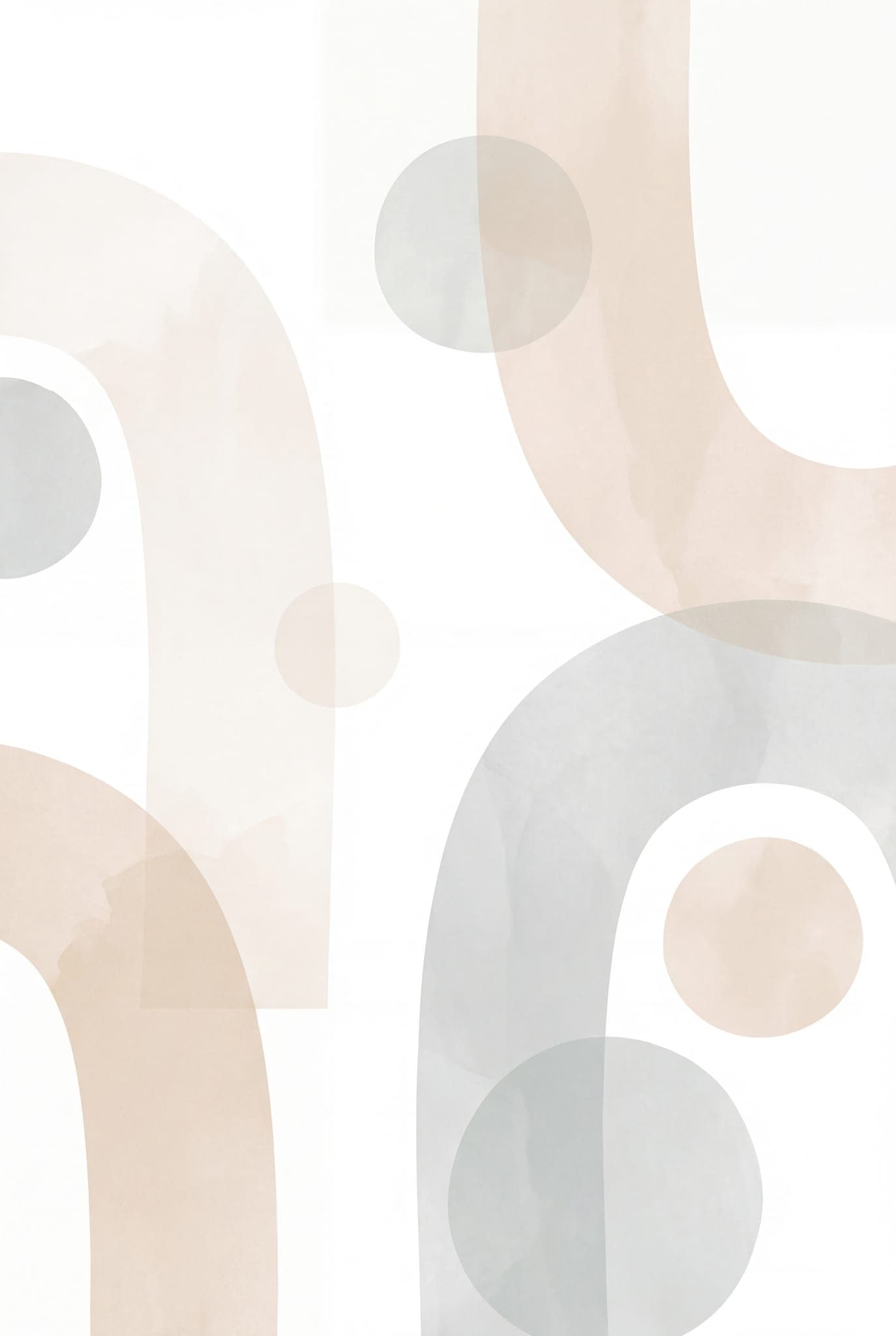
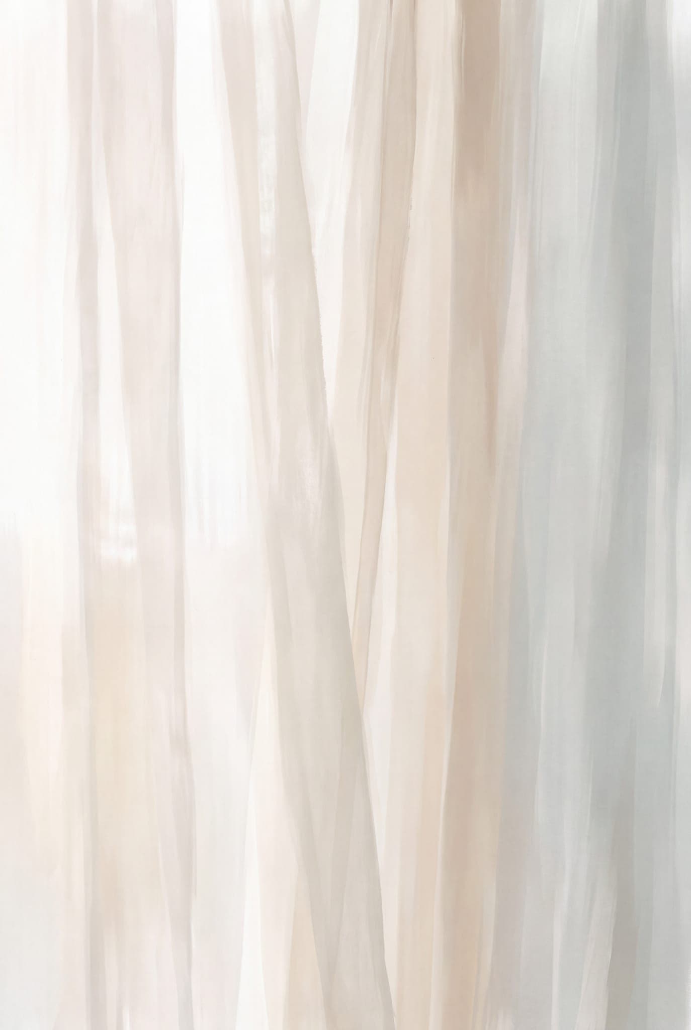
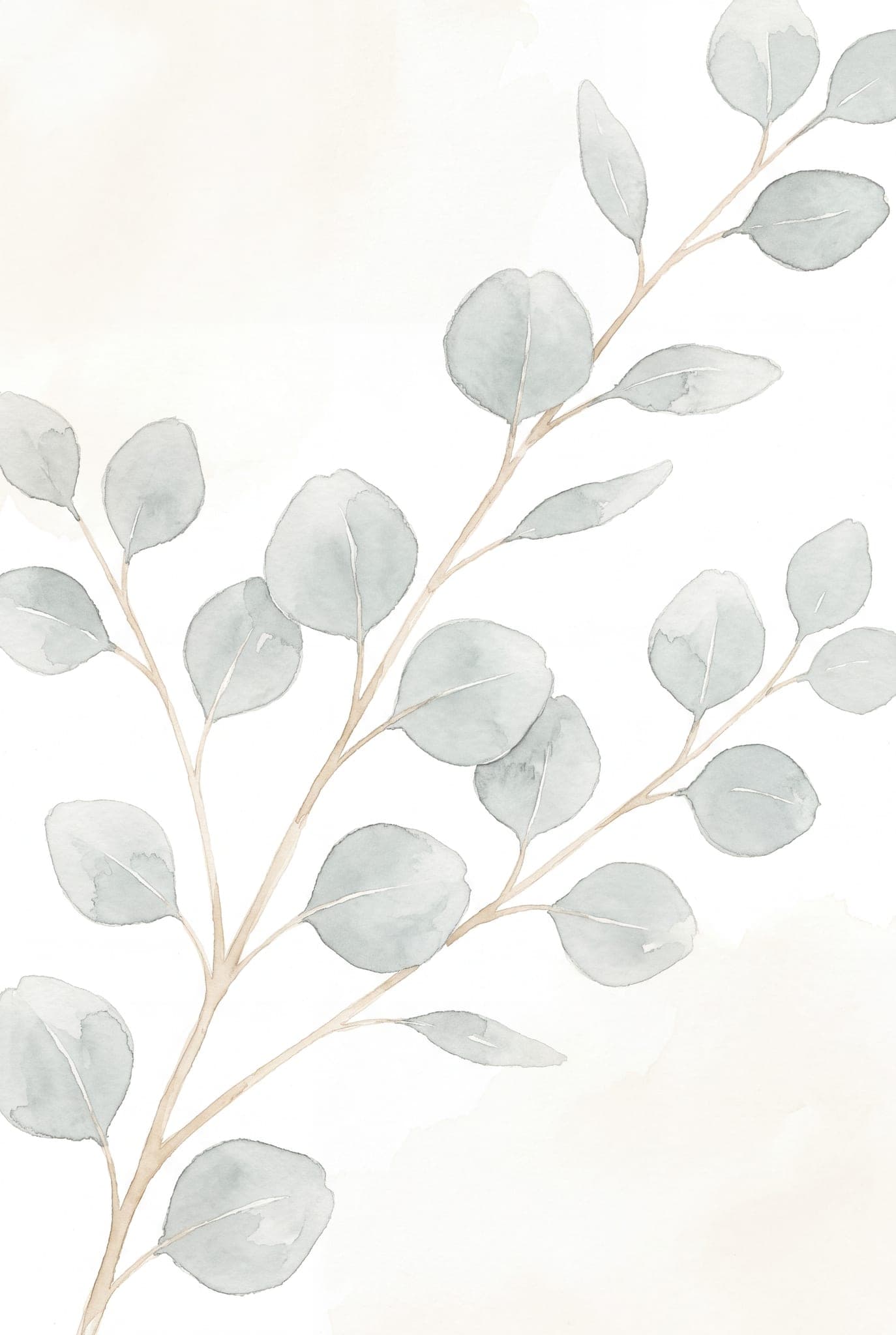
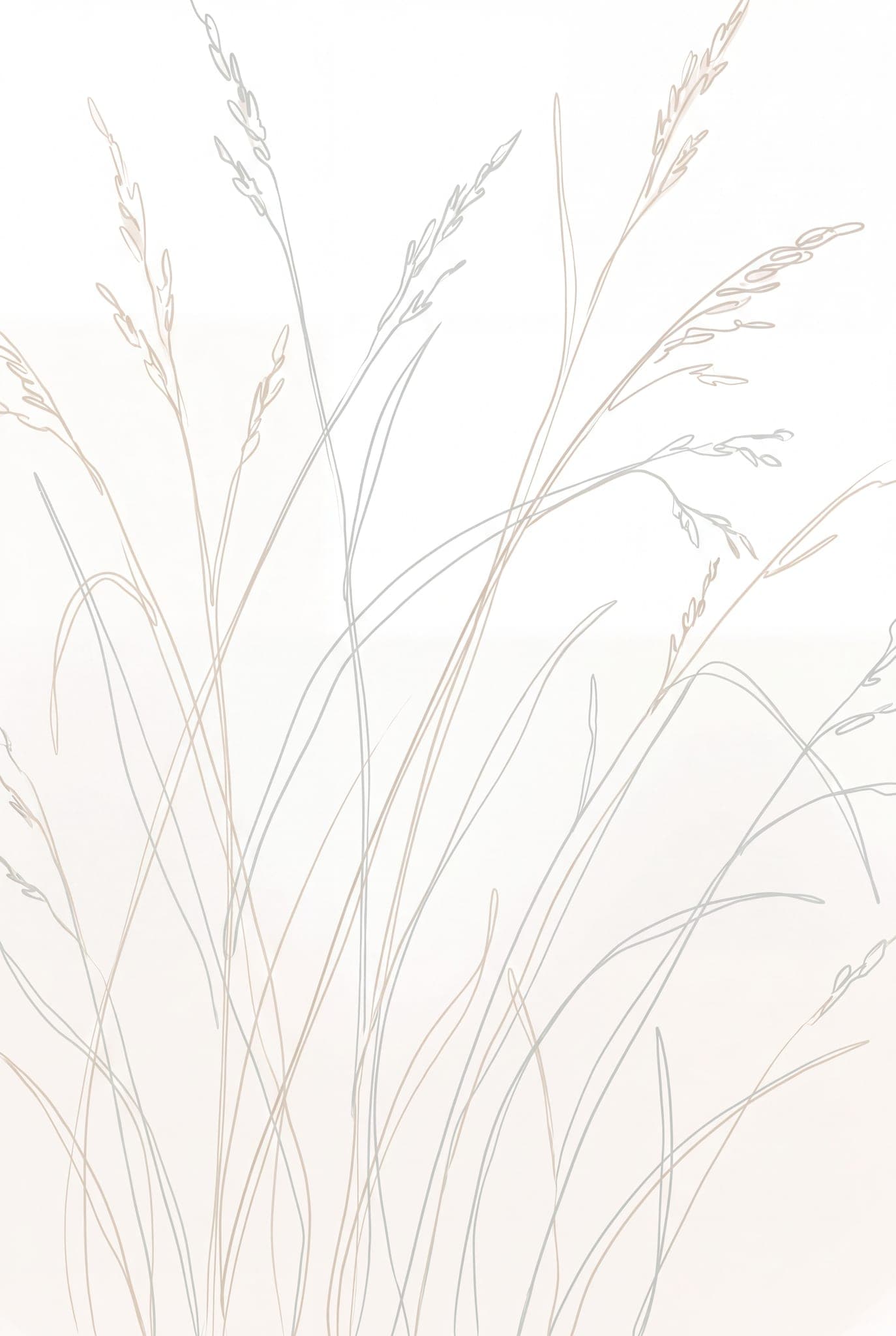
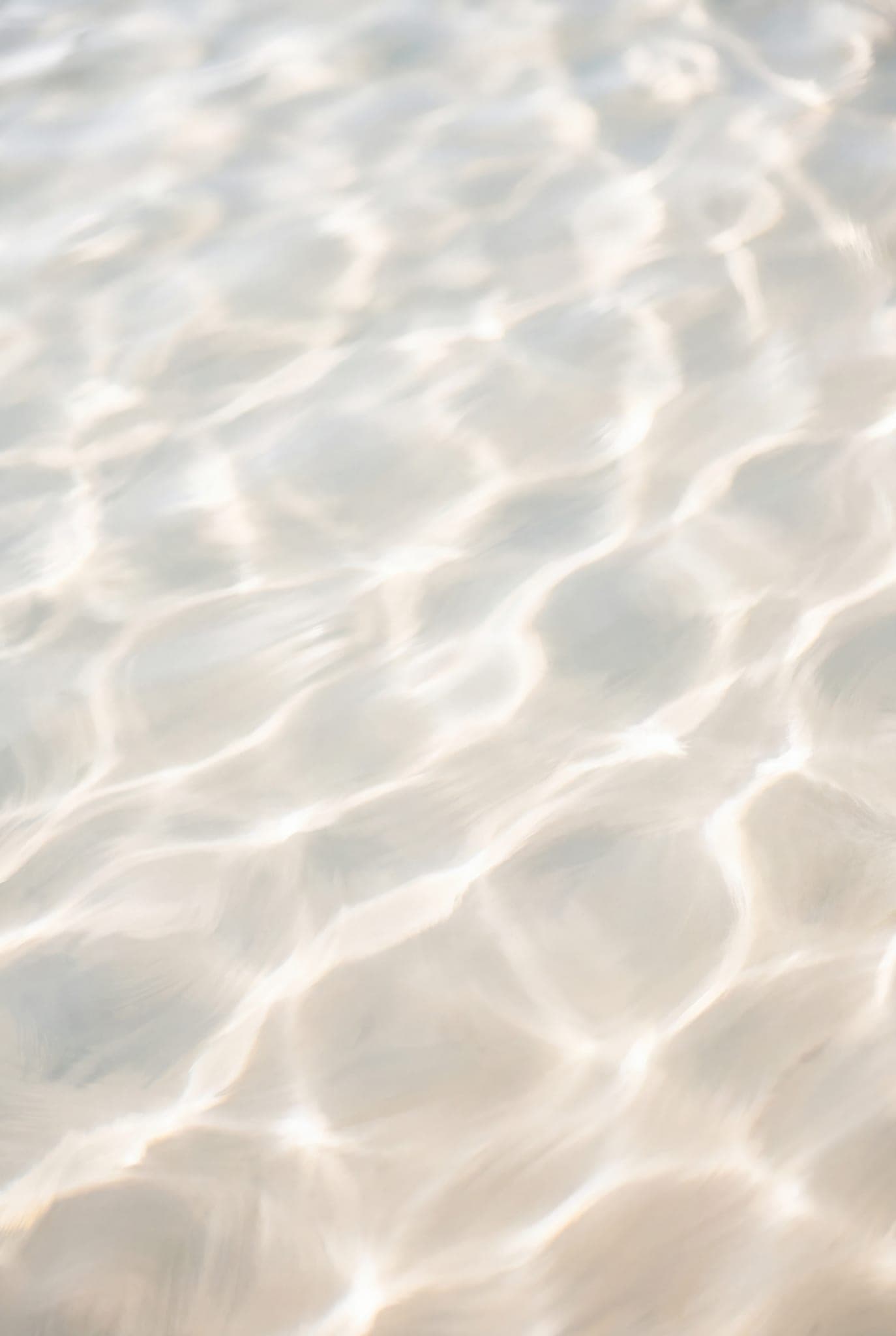
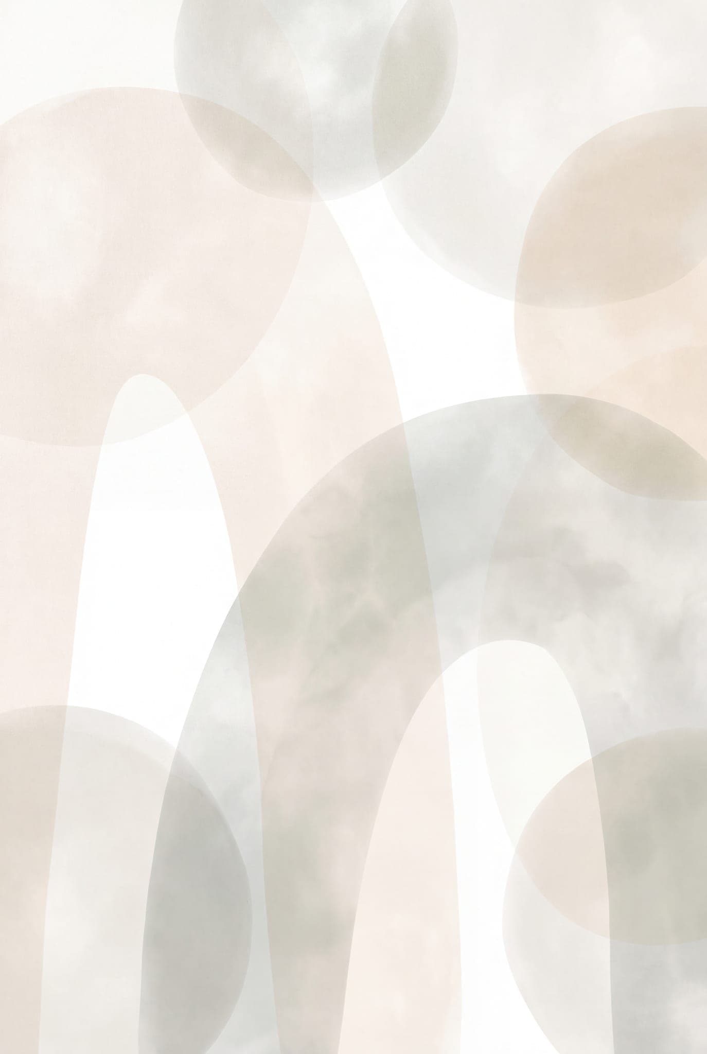
Soft clouds, a eucalyptus watercolour, a grass line drawing, sheer curtains, translucent overlapping shapes, arches with circles, and two water-ripple textures. Eight different subjects, one pale register, nothing competing with the window.
The palette card — with real paint codes
The four colours the prints are built on — a bright white, a pale warm neutral, a light wood tone and a soft mirror-grey — each matched to actual purchasable paints across Farrow & Ball, Sherwin-Williams and Benjamin Moore, with an honest rating of how close each match really is. On this style all four landed close. That's how this palette came out, not a promise we make for every kit.
The heights that make it look intentional
The 57-inch centreline — standard museum and gallery hanging practice, not a rule anyone enforces — 6 to 8 inches of air above a sofa or headboard, a print roughly two-thirds the width of the furniture under it, and 2 to 3 inches between frames in a pair or a row.
Print-ready files
Every print is 3392 × 5056 pixels, made for 2:3 photo frames — 4×6, 8×12 and 12×18in slip straight in with nothing to resize (any trim is under 1%), and it prints sharp to about A3.
Before you buy — the honest part
- These are digital files. Nothing is posted to you — you download and print them yourself, at home or at any print shop.
- The art is AI-generated, directed and curated by us. We'd rather say that plainly than let you assume otherwise.
- This art is deliberately low-contrast. From across the room it reads as a soft shape rather than a picture, and some people will find that too quiet. If you want a wall that announces itself, this is the wrong kit.
- Colour on paper never matches colour on a screen, and neither does paint. Ask your print shop for a matte or textured stock — pale art shows every bit of glare on glossy — and take the palette codes to the counter for a tester pot before you commit a wall to one.
- Eight prints is fewer than the thirteen in The Calm Room Kit, which is $19 for thirteen plus both guides — more prints per dollar than this. You're paying here for a set that agrees with itself — prints, paint and hanging heights — not for a bigger pile of files.
This is for you if
- ✓ Your room is already pale and you want art that doesn't fight it
- ✓ You're painting white or off-white and want it to land warm rather than clinical
- ✓ You'd rather the art sat quietly in the room than dominated it
Skip it if
- × You want the most prints per dollar — that's The Calm Room Kit: thirteen prints plus both guides for $19
- × You want one bold print to be the focal point of the room
- × You want a physical framed print delivered
A real guarantee
Buy it, open everything, and if it isn't for you, email within 14 days for a full refund — downloads included. No form to fill, no reason needed. We'd rather refund you than have you feel stuck with something you don't love.
The moment you pay
You land straight on your downloads page. Grab the single all-in-one PDF, or each file on its own — nothing to unzip. It's tied to your account, so you can come back and re-download any time. No email to wait for.
Questions
Will art this pale actually show up on a pale wall?
It will read quietly — that's what the style is. Two things help: hang them where daylight rakes across the wall rather than hitting it flat, and use a frame with a visible edge, light oak or plain white, so the print has a border instead of dissolving into the paint. If you want more contrast on the wall, the thirteen prints in The Calm Room Kit are the more grounded set.
What size can I print these?
They're 3392×5056 pixels made for 2:3 photo frames — the standard photo shape — so 4×6, 8×12, 12×18 and 16×24 slip straight in; the files sit within 1% of exact 2:3, so at most a hair trims at the frame edge. A3 is the one common size that isn't 2:3 (297×420mm is slightly squarer), so there you'll either trim about 6% off the length or leave a slim border — both look deliberate. Sharp up to about A3, and still good larger at normal wall-viewing distance.
Are the paint codes real products I can buy?
Yes. Each of the four colours is matched to the nearest actual paint in Farrow & Ball, Sherwin-Williams and Benjamin Moore, with the code you'd give the counter, and the card rates how close each match really is. On this style every one came out close — very close, or the same family. Where a match isn't close, our cards say so instead of printing a confident-looking code; the Japandi card does exactly that for one of its four. Screens still lie about colour, so buy the tester pot.
Do I have to paint to use this?
No. The prints sit happily on any white or warm neutral wall you already have. The palette card is for when you do paint, so the wall and the art aren't chosen months apart by two different versions of you.
Can I get a refund?
Yes, 14 days, no argument, digital downloads included. The licence covers personal use in your own home — email us if you need a commercial one.
Pale, warm and finished.
The prints, the paint codes and the hanging heights, chosen together — so a light room reads calm rather than bare.
14-day money-back guarantee · how refunds work